Friday, March 15, 2013
Balloon in a bottle
This is a great demo for making air pressure dramatically visible.
The "bottle" is a special flask with a hole in the bottom. Stuff most
of a limp balloon into the neck of the flask, mount the balloon's neck
onto the flask's neck, and inflate the balloon. When you take your
mouth off the balloon, it deflates, of course. Ask your audience to
predict what will happen if you put the stopper in before taking your
mouth off. Now inflate the balloon again, insert the stopper in the
hole at the bottom of the flask, take your mouth off, and TA-DA! The
balloon does not deflate, despite having its mouth held wide open by
the neck of the flask! This is really an astounding demo, and people
are delighted every time I do it.
The key to understanding this is that inflating the balloon pushes air
out of the flask through the hole in its bottom. With no stopper, air
rushes back in through the same hole when the balloon deflates. But
with a stopper, pulling air back in to the flask is not possible. As
soon as the balloon deflates just a tiny bit, the same amount of air
in the flask must occupy a larger volume, which means it lowers its
pressure. Each square inch of latex in the balloon's surface now
starts to feel a higher pressure from the inside of the balloon than
from the outside of the balloon, so it can't deflate any more.
(Experts: I am purposely omitting surface tension to keep it
simple for a young audience.) If you now remove the stopper, it
quickly deflates by drawing air into the flask through the newly made
hole.
There are further variations such as pouring water in the balloon
before removing the stopper (which creates a nice squirt of water when
you do remove the stopper).
If you can't find this specialized flask, you may be able to do a
similar demo with a regular bottle by using a straw in parallel with
the balloon to vent the bottle as you inflate the balloon. From the
videos I've seen, it takes some dexterity and practice to do this and
remove the straw to prevent further air flow at the critical moment,
but it is doable.
I did this Tuesday with the upper-graders at Peregrine School to
introduce pressure to our study of weather. Pressure is related to
temperature; pumping up a bike tire shows that compressing a gas
raises its temperature, and there are demos I will describe in a
future post which show how cooling a gas makes its pressure drop. So
hot air masses are associated with high pressure, and cool air masses
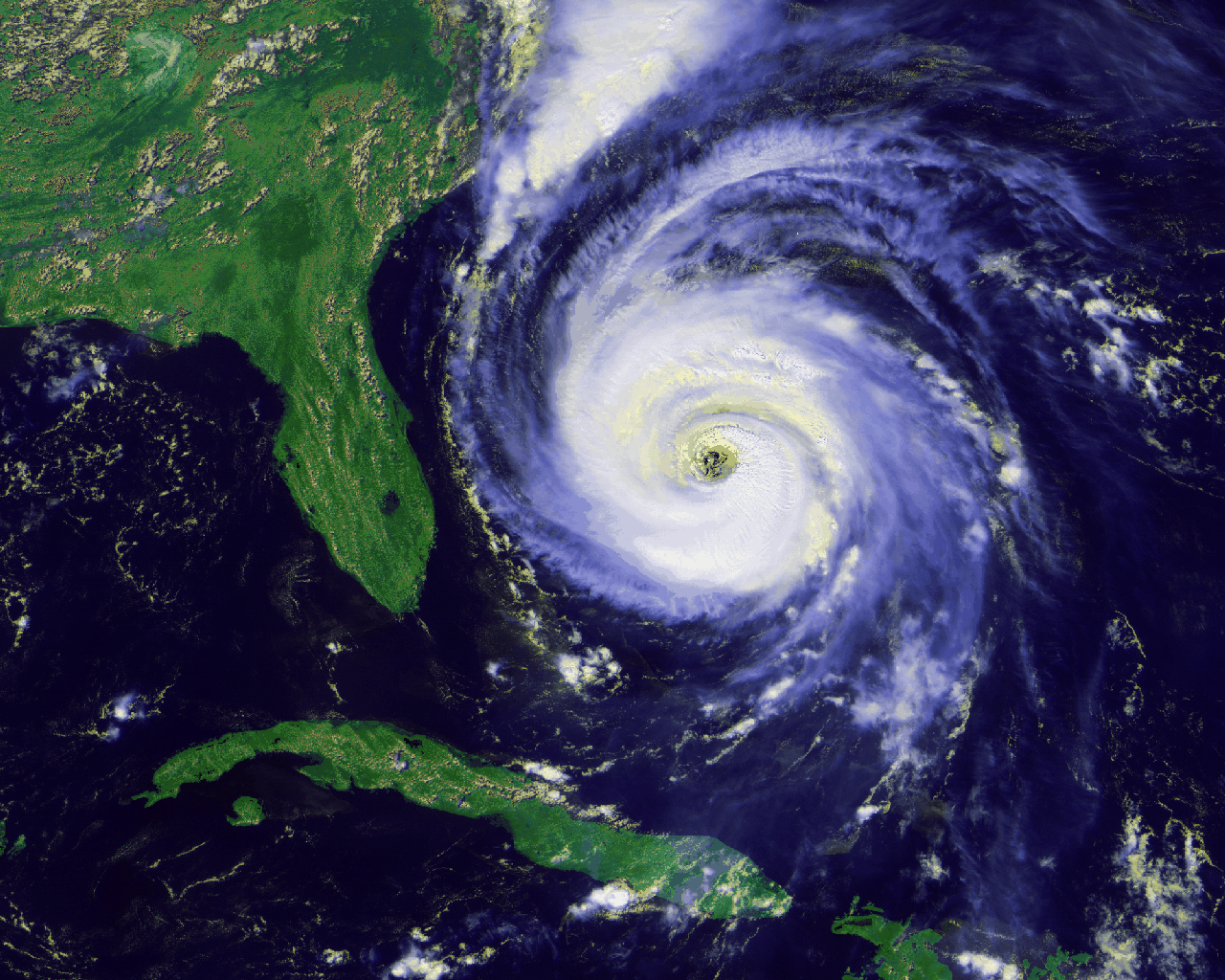
(and storms) are associated with low pressure. In low-pressure storms
like hurricanes, air is pushed from higher-pressure regions on the
periphery toward the center. Combining this with what we had just
learned about the Coriolis effect, we see that in the northern
hemisphere air will be deflected to its right, making a
counterclockwise circulation which is easily seen in satellite images:
In the southern hemisphere, air is deflected to its left as it tries
to go from outskirts to center, thus creating clockwise circulation.
We saw in our previous activity that the Coriolis effect cannot
determine the circulation in toilet bowls because a few inches' travel
is too small to be affected by riding on the 12,000-mile
merry-go-round we call Earth. But over hundreds of miles, the
Coriolis effect does build up and cause these wind patterns.
The next and last activity in our physics-behind-the-weather extravaganza was making clouds.
Thursday, March 14, 2013
Coriolis Effect
After learning how convection makes air "want" to circulate from
equator to pole at high altitudes and back from pole to equator at low
altitudes, we learned how that idealized picture of air flow is
modified by the Coriolis effect.
I won't explain the effect here, because there are plenty of good Web
resources on that, with MIT providing perhaps the best demo. As a
teacher, my quandary was whether to simply show the video of this
demo, or to try to actually do it in class. I took a risk on the
latter, and it worked out amazingly well. I built something like the
contraption shown in the MIT video, by borrowing a sturdy turntable (a
low one, much lower than a pottery turntable, so that a fall from it
would not hurt) and clamping a 2"x12"x8' plank to it. I put a kid on
each end, asked them to take some practice throws, and the spun it and
had them throw at will. They had a blast! Everyone insisted on taking
a turn---multiple turns---so we had plenty of chances to explore the
effects of different variables, such as direction of rotation, speed
of rotation, and distance over which the ball travels. When break
time arrived, the kids just kept playing with it, and kids from other
grades also came in the room and demanded their turn. I can honestly
say this was the most fun science activity I have done with kids.
They begged me to leave the device at school, but I did not leave it
because it would require constant adult supervision to keep it safe.
I strongly urge anyone teaching the Coriolis effect to do this
activity. The activity described in this post took about an hour, but
kids could play with this device for many hours. If you don't think
you can build one, a merry-go-round should provide a good substitute.
Back in discussion mode, we took some time to understand that Earth's
northern hemisphere is like a merry-go-round spinning
counterclockwise, so when low-altitude air tries to circulate from
pole to equator it gets deflected to the right and becomes a wind from
the northwest, whereas when high-altitude air tries to circulate from
equator to pole it gets deflected to the right and becomes a wind from
the southwest. This means that one giant circulation cell from
equator to pole and back is not feasible; it gets broken up into three
cells, from equator to about 30 degrees latitude, from 30-60 degrees
latitude, and from latitude 60 to the pole:
![]() |
| (Image from Wikipedia) |
The sourthern hemisphere is like a merry-go-round spinning clockwise,
so its air circulation cells (called Hadley cells) are a mirror image
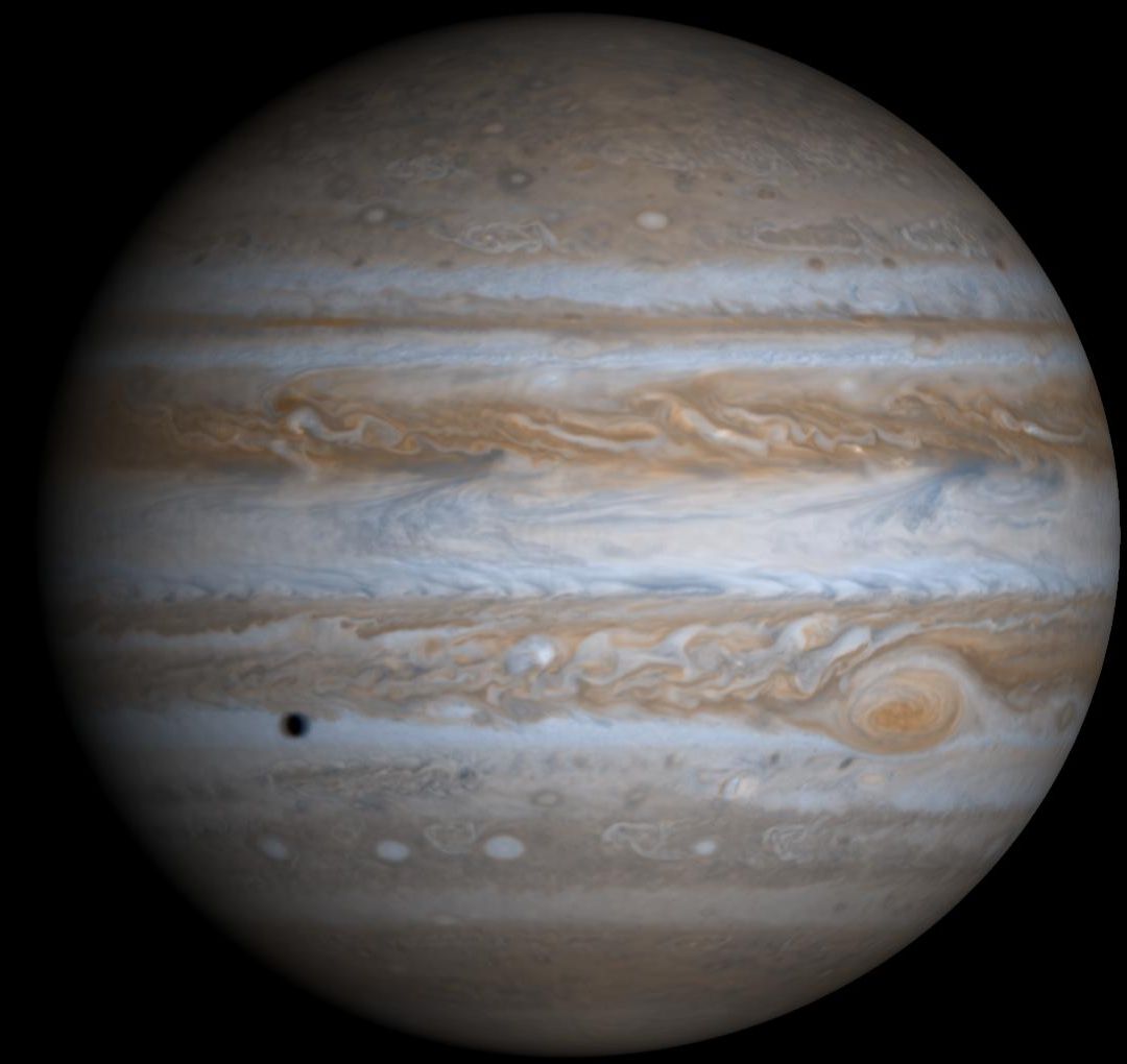
of the north's. On a faster-spinning planet such as Jupiter, the Coriolis effect
is much stronger and therefore the equator-to-pole tendency is broken up
into more cells. Each cloud band in this photo represents a cell:
An important thing to note about the Coriolis effect is that it does
not determine the direction of toilet flushes. Our experiment showed
that when traveling distances which are short compared to the diameter
of the merry-go-round, the ball is not noticeably deflected. Water
traveling a few inches from rim to center of a toilet ball is
traveling only a tiny, tiny fraction of the Earth's diameter, so the
Coriolis effect cannot be important. What is important is how water
is injected into the bowl.
I reinforced that idea by showing this video from a travel documentary,
whose producers and stars are completely taken in by locals living on the
equator purporting to demonstrate that water drains in different
directions just north of the equator vs just south of the equator. As
you watch this video, can you spot a major mistake the locals make?
Also, can you explain how the locals got the water to drain in
different directions at will?
In the next activity, we explored how the Coriolis effect also explains why storms like hurricanes circulate counterclockwise in the northern hemisphere and clockwise in the southern hemisphere.
Tuesday, March 12, 2013
Convection and Weather
This morning I guided the upper-graders at Peregrine School through a
set of weather-related activities.
First, we reviewed what we had learned previously about energy in the
Earth-Sun system. Briefly, although the Earth's core is very hot and
slowly cooling off due to heat flowing outward through the surface,
the vast majority of heat that we experience comes from the Sun. How
could we figure that out from everyday observations? Julia nailed it:
the surface temperature varies quite a bit from pole to equator and
from day to night, which is indicative of the Sun rather than of a
constant flow of heat outward in all directions from the Earth's core.
We also reviewed how the Sun heats the ground, not the air (because
air is transparent to visible light); air near the ground is heated by
the ground and that heat then gets mixed throughout the atmosphere.
Whenever something is heated from the bottom, as our atmosphere is,
you get convection (one of the three forms of heat transport we had
discussed earlier).
Convection is the reason we have weather. Hot air rises, cool air
sinks, and so air is always in motion. To assess the solidity of
their understanding of convection, I immersed a shot-glass full of hot
water (dyed red) into a big container of cool water (dyed ever so
slightly yellow to provide contrast), but first, I asked them to make
predictions about what would happen. This is a really nice, really
simple experiment or demo. You can see the hot fluid rising in wisps;
eventually all the red collects on the top half of the large
container. But the true test of understanding is predicting what
happens when I immerse a shot-glass full of cool water into a big
container of warm water. The kids showed a good understanding by
predicting that the cool water would not rise at all, and just stay in
the shot-glass (and the bit of cool water which might spill in the
process of setting the shot glass down in the large container would
also settle on the bottom of the large container). In weather, this
is called an inversion: if cold air gets under a layer of warm air, it
is trapped there, and among other things air pollution can build up in
a city where there's an inversion. (The Wikipedia article on inversion
has some decent pictures, and a Google image search on "weather
inversion" also yields some nice pics.)
Convection transports heat in the oceans as well as in the atmosphere.
There are ocean currents which circulate warm equatorial water toward
northern regions and bring cold water from the north back down toward
the equator to get warmed up again. The sea off California's coast is
rather cold because the current here comes from Alaska.
But the takeaway message of this part of the day (which took probably
only 20-25 minutes) is that the Sun provides the energy for moving air
around, which makes weather happen. Because of the way the Sun's
energy hits Earth, hot air must rise from equatorial regions and cold
air must sink near the poles. But the only way for this to be
sustainable is with a "conveyor belt": hot air which rises from
equatorial regions moves toward the poles, where it cools, sinks, and
moves along the surface back toward the equator. This creates wind
and weather patterns. Our next activity was designed to add more
nuance to this general idea.
Before proceeding to the next activity, I presented the class with a
lava lamp for long-term loan. This will constantly remind them of
convection even when I'm not there!
Saturday, March 2, 2013
Climate Change
Yesterday we tied together California (Grade 6) Science Standards 6
(resources), 3 (Heat), and 4 (Energy in the Earth System). We'd
already done quite a bit of 3 and 4, so we started with a discussion
of resources. The consequences of using resources (6a) led naturally to
the greenhouse effect, which builds on our previous understanding of
heat flow in the Earth-Sun system. We had previously calculated a
rough temperature that Earth "should" be at, ie the stable temperature
at which Earth should radiate just as much heat into space (in the
form of infrared light) as it gets from the Sun (mostly in the form of
visible light). This temperature was just below freezing, and it
turns out that a natural greenhouse effect makes Earth livable.
We started with this video, which is a nice short demo of how carbon
dioxide absorbs infrared light. C02 is by no means the only
greenhouse gas; water vapor is also very important, and methane
absorbs much more infrared light on a gram-for-gram basis, but there
is not enough methane in the atmosphere to make it the most important
greenhouse gas overall. We also watched a short clip of another
video, which demonstrated how the temperature of a bottle of carbon
dioxide increased more than a bottle of air when both were heated by a
lamp. This latter experiment requires only basic equipment and a
teacher might consider having the kids do the experiment, but I
suspect the experiment could be finicky in real life: you will have to
make sure there are no leaks in the C02 bottle, etc.
The kids were ahead of me on this one. They had already made the leap
to climate change, but I wanted to do at least a quick review to fill
in the logic. The atmosphere is basically transparent to visible
light, the form in which we get energy from the Sun; if it's not
transparent to infrared light, the form in which Earth gets rid of its
heat, then Earth must heat up. As stated above, we need a certain
amount of natural greenhouse effect to avoid freezing over, but there
can be too much of a good thing. We spent the rest of the time in
small groups, playing with a computer simulation of all this. This
simulation is really good, so I encourage you to click Run Now (it
takes a minute to load and start). You can adjust the level of
greenhouse gases from none (to see our previous calculation in action)
to lots. As I circulated around the groups, we discussed the effect
of clouds (keep us cooler during the day but warmer at night) vs
greenhouse gases (always keep us warmer). We also looked at the
Photon Absorption tab, which shows what's going on microscopically.
You can shoot visible or infrared photons (the smallest unit of light)
at a variety of molecules to see which are greenhouse gases. In the
main (Greenhouse Effect) tab, the view is too zoomed out to see what
the photons are interacting with when they bounce around. This was a
successful activity: students learned something as they explored, and
some students worked into their recess break to finish answering the
questions on the worksheet.
(Maven alert: it's common to say that greenhouse gases "trap" heat,
but this is not technically correct. It's more accurate to say that
they impede the flow of energy. I didn't correct the kids when they
said "trap", but teachers should be aware of this. Saying "trap" as a
teacher leaves you open to refutation.)
After the recess break, we discussed feedback loops and the
physics/engineering definition of positive and negative feedback
(which have nothing to do with psychological concepts such as negative
reinforcement or positive attitude). I asked them to classify 11
different situations as positive or negative feedback (eg, foxes
provide negative feedback on the rabbit population), and they did very
well, so the concept is possibly less challenging than I imagined. We
briefly discussed how confusing it is to have delayed feedback (eg
Alice says something to Bob and three days later he raises his voice).
Psychological experiments have shown that when feedback is delayed a
long time, people get very confused as to what causes what: they think
their actions have no effect, or the opposite effect. (For more on
this, I recommend the book The Logic of Failure.)
So it is with climate change. Scientists knew of CO2's heat
"trapping" properties more than a century ago and predicted rising
temperatures as we dumped more CO2 into the atmosphere, but it takes
so long for the heat to build up that it's easy to ignore. By the
time we really see the temperature rise in a very convincing way, we
have dumped so much C02 into the atmosphere that temperatures will
rise much more even if we take immediate action. Compounding this is
variability: if you just pay attention to the temperatures in your
neighborhood, there is so much variability from day to day and season
to season that it's impossible to notice a change in the average
temperature. To see the change, you have to average together many
thousands of temperature measurements.
Even after getting people to accept that line of reasoning, they will be
unimpressed by the global average change so far: 1.4 degrees Fahrenheit.
What's a degree or two between friends? But the change has been much
larger in some regions (the Arctic) and even 1.4 degrees results in a lot of
dislocation and expense: species have to adjust their ranges all over the world,
malaria may be able to move further from tropical regions, etc. Won't Canada
and the northern US be happy to be a little bit warmer? Maybe, but it's not that
simple. Rain patterns may shift, so farmers in Canada may not be so happy after
all. And northern forests are being destroyed at a rapid rate now that certain
kinds of beetles can survive the winter further north; beetles are mobile, but trees
are not, and the northern trees will be destroyed before they have time to
adapt to the beetle. And areas which do gain from climate change may
be overrun with refugees from areas which lose big-time.
Anyway, the delayed-feedback idea led into the carbon cycle. Over
tens of thousands of years the carbon cycle will remove excess carbon
from the atmosphere, so the Earth will not get hotter without limit
(thus answering an earlier question from a student).
Our final activity was looking at this interactive flood map. Seas
rise because the ocean heats up and expands (a very slow process) and
because of melting glaciers (not as slow, but still not easy to
predict). The standard prediction for the year 2100 (when these
students will be old, but quite possibly still alive) is about 1 meter
of sea level rise, so I asked the students to dial in 1 meter and
answer a few questions about impacts on their house and on nearby
areas. But the slowness of the ocean expansion means that the impact
of the current amount of carbon is further down the road, and has been
estimated to be 21 meters. So I asked the students to dial in 21
meters and answer a few more questions. This was another successful
activity combining student exploration with learning; I urge readers
of this blog to try the interactive flood map as well. Twenty-one
meters seems insane, so some kids need to be reassured that it will be
slow, over hundreds of years and perhaps a thousand years, so people
will have time to evacuate and adjust. Still, evacuation and
adjustment are costly financially and emotionally so it may be better
to prevent the need for so much evacuation and adjustment in the first
place.
I didn't have time for a few things I wanted to show, but I can link to them here.
First, a quick Google image search for "glacier comparison" shows how fast most
glaciers are melting. It is astounding*. Second 30 seconds from this story about the
documentary Chasing Ice provide another dramatic look at glacier melting. (Sorry,
you will probably have to watch an ad to see this, but I couldn't find a better link.)
P.S.: Another important point for teachers of this subject is to emphasize that
"global warming" doesn't mean "every part of the Earth warms all of the time."
There is a model behind the predictions, a model with moving parts which affect
each other so that the predictions are richer than a novice imagines. For example,
a warmer atmosphere will also be a more humid atmosphere, so many areas will
get more precipitation and more intense storms. If you live in a place where it's
cool enough to snow occasionally, then yes, global warming predicts that you can
get more snow. People who think a big snowstorm contradicts predictions of
climate models simply haven't taken the time to get familiar with what climate
models really predict. A scientific model should make a rich set of nuanced
predictions: that makes it easier to set up stringent experimental tests of the model.
This nuance does mean that scientists must work harder to educate the public. If
any scientists are reading this, I plead with you to put in that hard work. Society
needs you.
*Climate change deniers have recently made a big deal about a study showing that glaciers in some parts of the Himalayas are actually growing. Note the qualified phrase "some parts of the Himalayas." This is NOT what's happening to most glaciers around the world. As noted above, climate change may have some "winners" as well as losers. But I doubt the "winners" will feel very secure with so much dislocation in the world.
(resources), 3 (Heat), and 4 (Energy in the Earth System). We'd
already done quite a bit of 3 and 4, so we started with a discussion
of resources. The consequences of using resources (6a) led naturally to
the greenhouse effect, which builds on our previous understanding of
heat flow in the Earth-Sun system. We had previously calculated a
rough temperature that Earth "should" be at, ie the stable temperature
at which Earth should radiate just as much heat into space (in the
form of infrared light) as it gets from the Sun (mostly in the form of
visible light). This temperature was just below freezing, and it
turns out that a natural greenhouse effect makes Earth livable.
We started with this video, which is a nice short demo of how carbon
dioxide absorbs infrared light. C02 is by no means the only
greenhouse gas; water vapor is also very important, and methane
absorbs much more infrared light on a gram-for-gram basis, but there
is not enough methane in the atmosphere to make it the most important
greenhouse gas overall. We also watched a short clip of another
video, which demonstrated how the temperature of a bottle of carbon
dioxide increased more than a bottle of air when both were heated by a
lamp. This latter experiment requires only basic equipment and a
teacher might consider having the kids do the experiment, but I
suspect the experiment could be finicky in real life: you will have to
make sure there are no leaks in the C02 bottle, etc.
The kids were ahead of me on this one. They had already made the leap
to climate change, but I wanted to do at least a quick review to fill
in the logic. The atmosphere is basically transparent to visible
light, the form in which we get energy from the Sun; if it's not
transparent to infrared light, the form in which Earth gets rid of its
heat, then Earth must heat up. As stated above, we need a certain
amount of natural greenhouse effect to avoid freezing over, but there
can be too much of a good thing. We spent the rest of the time in
small groups, playing with a computer simulation of all this. This
simulation is really good, so I encourage you to click Run Now (it
takes a minute to load and start). You can adjust the level of
greenhouse gases from none (to see our previous calculation in action)
to lots. As I circulated around the groups, we discussed the effect
of clouds (keep us cooler during the day but warmer at night) vs
greenhouse gases (always keep us warmer). We also looked at the
Photon Absorption tab, which shows what's going on microscopically.
You can shoot visible or infrared photons (the smallest unit of light)
at a variety of molecules to see which are greenhouse gases. In the
main (Greenhouse Effect) tab, the view is too zoomed out to see what
the photons are interacting with when they bounce around. This was a
successful activity: students learned something as they explored, and
some students worked into their recess break to finish answering the
questions on the worksheet.
(Maven alert: it's common to say that greenhouse gases "trap" heat,
but this is not technically correct. It's more accurate to say that
they impede the flow of energy. I didn't correct the kids when they
said "trap", but teachers should be aware of this. Saying "trap" as a
teacher leaves you open to refutation.)
After the recess break, we discussed feedback loops and the
physics/engineering definition of positive and negative feedback
(which have nothing to do with psychological concepts such as negative
reinforcement or positive attitude). I asked them to classify 11
different situations as positive or negative feedback (eg, foxes
provide negative feedback on the rabbit population), and they did very
well, so the concept is possibly less challenging than I imagined. We
briefly discussed how confusing it is to have delayed feedback (eg
Alice says something to Bob and three days later he raises his voice).
Psychological experiments have shown that when feedback is delayed a
long time, people get very confused as to what causes what: they think
their actions have no effect, or the opposite effect. (For more on
this, I recommend the book The Logic of Failure.)
So it is with climate change. Scientists knew of CO2's heat
"trapping" properties more than a century ago and predicted rising
temperatures as we dumped more CO2 into the atmosphere, but it takes
so long for the heat to build up that it's easy to ignore. By the
time we really see the temperature rise in a very convincing way, we
have dumped so much C02 into the atmosphere that temperatures will
rise much more even if we take immediate action. Compounding this is
variability: if you just pay attention to the temperatures in your
neighborhood, there is so much variability from day to day and season
to season that it's impossible to notice a change in the average
temperature. To see the change, you have to average together many
thousands of temperature measurements.
Even after getting people to accept that line of reasoning, they will be
unimpressed by the global average change so far: 1.4 degrees Fahrenheit.
What's a degree or two between friends? But the change has been much
larger in some regions (the Arctic) and even 1.4 degrees results in a lot of
dislocation and expense: species have to adjust their ranges all over the world,
malaria may be able to move further from tropical regions, etc. Won't Canada
and the northern US be happy to be a little bit warmer? Maybe, but it's not that
simple. Rain patterns may shift, so farmers in Canada may not be so happy after
all. And northern forests are being destroyed at a rapid rate now that certain
kinds of beetles can survive the winter further north; beetles are mobile, but trees
are not, and the northern trees will be destroyed before they have time to
adapt to the beetle. And areas which do gain from climate change may
be overrun with refugees from areas which lose big-time.
Anyway, the delayed-feedback idea led into the carbon cycle. Over
tens of thousands of years the carbon cycle will remove excess carbon
from the atmosphere, so the Earth will not get hotter without limit
(thus answering an earlier question from a student).
Our final activity was looking at this interactive flood map. Seas
rise because the ocean heats up and expands (a very slow process) and
because of melting glaciers (not as slow, but still not easy to
predict). The standard prediction for the year 2100 (when these
students will be old, but quite possibly still alive) is about 1 meter
of sea level rise, so I asked the students to dial in 1 meter and
answer a few questions about impacts on their house and on nearby
areas. But the slowness of the ocean expansion means that the impact
of the current amount of carbon is further down the road, and has been
estimated to be 21 meters. So I asked the students to dial in 21
meters and answer a few more questions. This was another successful
activity combining student exploration with learning; I urge readers
of this blog to try the interactive flood map as well. Twenty-one
meters seems insane, so some kids need to be reassured that it will be
slow, over hundreds of years and perhaps a thousand years, so people
will have time to evacuate and adjust. Still, evacuation and
adjustment are costly financially and emotionally so it may be better
to prevent the need for so much evacuation and adjustment in the first
place.
I didn't have time for a few things I wanted to show, but I can link to them here.
First, a quick Google image search for "glacier comparison" shows how fast most
glaciers are melting. It is astounding*. Second 30 seconds from this story about the
documentary Chasing Ice provide another dramatic look at glacier melting. (Sorry,
you will probably have to watch an ad to see this, but I couldn't find a better link.)
P.S.: Another important point for teachers of this subject is to emphasize that
"global warming" doesn't mean "every part of the Earth warms all of the time."
There is a model behind the predictions, a model with moving parts which affect
each other so that the predictions are richer than a novice imagines. For example,
a warmer atmosphere will also be a more humid atmosphere, so many areas will
get more precipitation and more intense storms. If you live in a place where it's
cool enough to snow occasionally, then yes, global warming predicts that you can
get more snow. People who think a big snowstorm contradicts predictions of
climate models simply haven't taken the time to get familiar with what climate
models really predict. A scientific model should make a rich set of nuanced
predictions: that makes it easier to set up stringent experimental tests of the model.
This nuance does mean that scientists must work harder to educate the public. If
any scientists are reading this, I plead with you to put in that hard work. Society
needs you.
*Climate change deniers have recently made a big deal about a study showing that glaciers in some parts of the Himalayas are actually growing. Note the qualified phrase "some parts of the Himalayas." This is NOT what's happening to most glaciers around the world. As noted above, climate change may have some "winners" as well as losers. But I doubt the "winners" will feel very secure with so much dislocation in the world.
Wednesday, February 27, 2013
The Dating Game
Our third activity last Friday was on radioisotope dating. (Everyone
has heard of carbon dating but carbon is just one of many radioactive
isotopes used for dating, and not even the most useful one for
geology, as we'll see below.) This tied in with the other two
activities, because a certain age pattern in seafloor rocks was a
prediction generated by students' model of continental motions. So
how do we measure the ages of rocks?
I prepared a whole bunch of small pieces of paper which were purple on
one side and white on the other. Each group got a handful and put
them all purple-side up. These represent potassium-40 atoms. Each
group started constructing a graph of the number of potassium-40 atoms
vs time. Let's say we start with 100 such atoms at a time we call
zero (we'll see later what this really means). Over 1.25 billion
years, half of the potassium-40 atoms decay into argon-40 atoms. The
students represent this by flipping over half of the "atoms" so the
white side is up. Once flipped over, it can never flip back. One
analogy is that once a ball rolls downhill, it's not going to roll
back up; similarly the argon-40 atom is in a lower-energy state. (The
word "decay" evokes an irreversible process, for good reason.) So now
the student plots 50 atoms at a time of 1.25 billion years. After
another 1.25 billion years, half of the remaining potassium-40 atoms
decay, so we now have 25 left and we plot that. We may also want to
keep track of the number of argon-40 atoms, so (in a different color
pencil) we put zero of those atoms at time zero, 50 at 1.25 billion
years, and 75 at 2.5 billion years.
Keep going with this process. In another time step, the 25
potassium-40 atoms decay into 12 or 13 argon-40 atoms. An atom can't
be half-decayed, and there is an element of randomness in this
process, so you can flip a coin or just decide randomly if it's 12 or
13. (Aficionados will recognize that there is some probability of 11
or 14 as well, but that's beyond the scope here.) Keep going until
you run out of graph paper, then connect the dots.
Now, how can we tell how old a rock is? Look at the ratio of potassium-40 to
argon-40 atoms: 1:0 at the start, 1:1 at t=1.25 billion years, 1:3
at 2.5 billion years, 1:7 at 3.75 billion years, etc. Measuring this
ratio provides an unambiguous estimate of the age of the rock. I had
the kids field a few practice questions where I would give an age and
they would give a ratio or percentage, or vice versa. (If you're more comfortable
with percentages, as a percentage of the total potassium-40+argon-40 atoms, it's
100% potassium-40 at the start, 50% at 1.25 billion years, 25% at 2.5 billion
years, 12.5% at 3.75 billion years, etc.)
But what do we mean by the "age" of a rock? This is really key to
understanding the whole thing. Argon is a gas, so when a rock is
molten the argon will just bubble out. So when a rock solidifies, it
has no argon atoms, and a 1:0 ratio of potassium-40 to argon-40 atoms.
So t=0 corresponds to the last time that the rock solidified, which is
exactly the tool we need to date the age of new ocean floor oozing out
of the mid-Atlantic ridge!
The half-life of potassium-40 is well suited to dating rocks because
so many of them are so old. What if we wanted to date something
younger, like a human skeleton from an archaeological dig? Even if it
was 4000 years old, the ratio of potassium-40 to argon-40 would be so
close to 1:0 that we wouldn't be able to tell. We need something with
a shorter half-life, like carbon-14, which decays to carbon-12 with a
half-life of only 5730 years. Carbon-14 is great for dating
skeletons, but if we tried to use it to date a rock, we would most
likely find zero carbon-14 left so we would only be able to say that
it's many half-lives old. To say that a rock is at least 10 of those
half-lives, or about 60,000 years old, is not very useful.
(Teacher warning: a lot of the implementation details are different
for carbon-14 dating. For instance, there is never a 1:0 ratio of
carbon-14 to carbon-12, not even close. So adapting this exercise to
carbon dating would be tricky.)
This was a good activity for the 25 minutes we had left. I wouldn't
try to squeeze this activity into any less time, but we definitely
could have used more time. For example, we could have plotted the
ratio; used our computer skills to make plots, including of the ratio;
brought in some algebra to calculate things quickly through an
equation rather than graphically; etc.
Saturday, February 23, 2013
Trembling in our Books
Yesterday we did three activities related to plate tectonics: making a
model of continental motion and generating predictions from it;
locating earthquakes; and radioisotope dating of rocks. The second
activity followed roughly the reasoning outlined here. However, I
didn't want to get into S and P waves, so instead of measuring the
distance from the epicenter to the seismograph by analyzing the wave
form, I decided to "simplify" and give students the time of arrival at
the three seismographs. Only after we started the activity did I
realize that although the timing information I gave was sufficient,
some serious algebra would be required to solve the problem with just
that information. So I ended up giving them the distance from the
earthquake to one of the seismographs, just to get them started.
Using timing information to solve for a location is an important
problem with many real-world aspects. For example, GPS uses exactly
the kind of reasoning shown in the last figure of the page linked to
above, but in full 3-d with satellites distributed around the Earth,
to solve for your full 3-d location. So I like the pure-timing aspect
of my version of the activity, but I have to find a way to make
workable for 5-7 graders.
Still, I don't think the kids noticed all this scrambling going on
behind the scenes. They got the main ideas: the intersections of two
circles are the candidate epicenters based on two seismographs, and a
third seismograph can be used to resolve the ambiguity. And they had
fun finding the mystery location of the epicenter. I think we took
about 40 minutes on this activity, including a 5-minute opening
discussion on the link between earthquakes and our previous activity.
Get My Drift?
Yesterday we did three activities related to plate tectonics: making a
model of continental motion and generating predictions from it;
locating earthquakes; and radioisotope dating of rocks.
In the first activity, I gave students cutouts of the continents.
(The best way to find these is by googling terms related to this
activity; you can't just print a world map because of the distortion
inherent in most projections.) The cutouts were on their desks as the
students filed in, so it was interesting to see what the students did
without any instructions: mostly arrange them as they are now rather
than try to put them together like a puzzle. But it only took a small
hint to get them assembling the puzzle. Once each group settled on a
way of fitting the continents together, I had them glue the model to
one side of a handout I had prepared. On the other side they were
instructed to make four specific predictions about what would be
observable if this model were true. I had to drop some major hints,
but the groups did eventually come up with the same four major
categories: (1) fossils on once-adjacent pieces of land should be the
same even though they are now very far apart; (2) living creatures on
once-adjacent pieces of land should be similar (making allowance for
evolutionary changes and for especially mobile animals such as birds
to be excluded from this analysis; (3) an expanding ocean floor should
be young in the middle where it spreads apart, and progressively older
near the continents (some groups put more emphasis on finding an
identifiable mid-ocean feature, but it's basically the same idea); (4)
once-adjacent pieces of land should have very similar older rock
layers even though they are now very far apart. One thing no one got
even though I mentioned GPS is that we should be able to measure the
distance between, say, North America and Europe increasing very
slightly each year (it is, by a few centimeters per year).
I had planned for this to be iterative. In my original plan the
groups were to make a very specific prediction such as "fossils found
in this part of Antarctica match the fossils in this part of
Australia", and then I would look that up quickly (to prevent
computers from being a distraction), and then after seeing how all
four predictions went they would make a better model on a new sheet of
paper (I brought lots of continent cutouts). But the initial puzzle
assembling took much, much longer than I anticipated. Some groups
took a lot of time to trim their rough-cut continent cutouts in
exquisite detail; others rearranged theirs many times; others just
didn't focus as much as I would have liked. So we didn't go through
another iteration. But one lesson that was clear to me at least is
that although South America fits nicely into Africa, almost nothing
else matches that clearly. At some point you have to guess (this is
clear when comparing the different guesses of the different groups),
and at that point you have to look for fossil evidence to verify or
falsify your guess. That whole process is what science is really all
about!
In the time left before break, I asked the students to guess why the
continents move. They had a lot of crazy theories, but I steered it
back to what we had learned last week: the core of the Earth is hot,
heat flows to areas of lower temperature, and it can flow through
radiation, conduction, and/or convection. We talked about how each of
these might or might not apply in this case, and figured out that
convection is well suited to transporting heat through the mantle,
which is fluid although not really molten. Once we got this all into
a diagram with convection loops in the mantle, it was clear that this
was a very plausible mechanism for making continents move.
This whole activity took 45 minutes, and as I mentioned I probably
should have budgeted much longer, and/or come up with ways to save
lots of time on the puzzle-assembly. Devoting time to verify or
falsify specific predictions and come up with a better model would
have been a great illustration of the process of science. Maybe it
should be a homework. But, apart from this reservation, I think it's
a great activity.
Subscribe to:
Posts (Atom)