An important part of science---of life, I would argue---is making inferences from data. (Contrary to some popular perception, it is not all that we do, but it is a large part.) This process is a lot more interesting than many people think, and this is best conveyed by stories where it went horribly wrong. I just published a paper rebutting a paper in which it went wrong; not horribly so, but to make this post understandable I will weave a few of these horrible stories into my tale.
The paper I rebutted claimed that one method (called weak gravitational lensing) of measuring the mass of a certain galaxy cluster gave an answer too low compared to the answers obtained through two other methods, and therefore the lensing method itself was suspect. The context is that astronomers find it very difficult to measure the mass of anything, since we are so far away. If the cluster is not changing over time, we can relate the velocities of the galaxies in the cluster to its mass (called the dynamical method) and we can also relate the cluster's X-ray emission to its mass. But that's a big if, and we would like a method which does not depend on this assumption. Lensing is such a method; it has weaknesses too, but I don't want to get too deeply into that here. The central question in this paper is really simple and applies to many situations: when numbers seemingly disagree, how do we characterize the strength of disagreement given that there is some uncertainty associated with each number?
The original paper made a model of the cluster using the X-ray method, and simulated weak lensing measurements of this model to see how often the simulated measurements gave answers as low as the actual weak lensing measurements. This is a great technique; it gives us what's called a p-value. By tentatively assuming that weak lensing is as effective as the X-ray method---the "null hypothesis"---we will see how often the inherent uncertainties in weak lensing would just randomly give us an answer as low as we got in real life. If the answer is "never" then we can state that our null hypothesis is wrong and weak lensing is not as effective as the X-ray method. More quantitatively, if the answer is "in 1 out of every 100 experiments" we would say p=0.01, which has the naive interpretation of "99% confidence that the null hypothesis is rejected." (One of the reasons it's naive is that if you tested, say, 100 different true hypotheses, you would still expect one to randomly come out with p=0.01. So the true interpretation is more nuanced. I will develop this further below.)
Now, what if this method gives you p=0.1 or so? You can't really reject the null hypothesis unless you have stronger proof than that, so you may go out and take more data, do more experiments, etc, to get the stronger proof. If you do so, make sure that the new experiments are independent of the original one. For example, if you want to prove that tall people are better basketball players than short people, the null hypothesis would be that they are the same and you might record the score from a scrimmage in which a tall person plays against a short one. If the tall person comes out slightly ahead, you will not have strong proof that the tall person is better, so you might replay the scrimmage. But if you play the same two people against each other, you can never prove that tall is better; the most you might prove is that player A is better than player B. To make the trials independent, you have to play a different tall person against a different short person. In more general terms, if you're trying to get an idea of the natural variation or "noise" in your measurement, you have to repeat the measurement in a way that actually incorporates those variations. What this paper did was equivalent to failing to recognize the nonindependence of identical triplet weak lensing players. They ran three scrimmages between an X-ray player and each of these three weak lensing players, mistakenly yielding a strong conclusion about X-ray vs weak lensing.
This idea of independence---and recognizing nonindependence even when it's subtle---is really important. Ben Goldacre in his book Bad Science relates the story of a woman suspected of murder because two of her kids died of sudden infant death syndrome. The chance of one baby dying of SIDS was stated as 1 in 8543. Prosecutors assumed that the chance of a second child dying of SIDS (over the course of years, not in the same incident) was independent of the chance of the first child dying of SIDS, so we can multiply probabilities and come up with a 1 in 73,000,000 chance of two babies dying of SIDS; so unlikely that we might suspect murder. But they're not independent. If SIDS has anything to do with genes or environment then they can't be independent, because the babies have the same parents and the same house. Given the shared genes and environment, the second baby's chance of SIDS may actually be quite high. In that case, we have no reason to suspect murder. The prosecutors vastly overstated the statistical case for murder by failing to recognize the non-independence. (That's not the only mistake the prosecutors made. I highly recommend Goldacre's book.)
A second mistake the authors of the weak lensing paper made was multiplying the p-values from the three experiments to obtain an overall p-value. Many people, even scientists, fall into the following trap: Say Experiment A gives p=0.10 and you interpret that as only a 10% chance that the null hypothesis is correct. Now independent Experiment B gives p=0.08, which you interpret as only an 8% chance that the null hypothesis is correct. It is natural to think that the experiments together imply only 8% of a 10% chance of the null hypothesis being correct, or p=0.008. But it's wrong! You have vastly underestimated the chance of the null hypothesis being correct, just as the paper we rebutted vastly underestimated the chance that the weak lensing measurements were actually consistent with the dynamical and X-ray measurements. Even if the experiments are independent, you should not multiply the p-values.
Here's an easy way to confirm that the above procedure is wrong: following an equivalent procedure you could also interpret p=0.10 as a 90% chance that the null hypothesis is incorrect and p=0.08 as a 92% chance that the null hypothesis is incorrect. Multiplying them, we would get an 82.8% chance that the null hypothesis is incorrect. But the same process in the previous paragraph yielded an 0.8% chance that it's correct, which doesn't match the 82.8% chance that it's incorrect. So something's wrong with the process! And it gets more wrong as you do more experiments and more multiplications. If we do 100 independent experiments and follow this line of reasoning, we will come up with a vanishingly small chance of the null hypothesis being correct, and a vanishingly small chance of the null hypothesis being incorrect, regardless of the specific p-values, because they are always less than one. You will rule out things which do not deserve to be ruled out. Goldacre gives the horrifying example of a nurse who was suspected of murdering patients and convicted largely on the basis of faulty statistics but was eventually freed. I'm going to make up the following numbers for simplicity. Let's say that some number of patients died while she was working, such that there was only a 10% chance that that would have happened randomly. So you start poking around, and find that at the previous hospital where she worked, there was only a 50% chance of that large a number of patients dying, and at the hospital before that only a 70% chance, and at the hospital before that only a 30% chance, etc. Multiplying all these together gives a really small chance that all these things occurred randomly. But you know by now that multiplying these is wrong.
Why is it wrong? Probabilities can be multiplied (1/2 chance of heads in each coin toss means 1/4 chance of two heads in two coin tosses), but despite its name, the p-value is not a simple probability that the null hypothesis is true. It's a measure of consistency which is constructed so that for any one experiment we interpret all but the lowest p-values as being consistent with the null hypothesis. Therefore p=0.5, say, is perfectly consistent with the null hypothesis; it does not mean a 50% chance of it being true or false. In the hypothetical example above, p=0.50 actually means that an average number of patients died on shift (deaths on random shifts rose to [at least] that level 50% of the time) and p=0.70 actually means that fewer than average patients died on shift (deaths on random shifts rose to [at least] that level 70% of the time). A correct way to combine p-values for independent experiments is Fisher's method. Had the paper we rebutted used that method, they would have seen that the dynamical and weak lensing measurements were entirely consistent, even without correcting the error regarding nonindependent trials. Correcting both errors makes it even more clear.
This stuff is complicated and it's easy to go wrong. Happily, many incorrect inferences in science are caught relatively quickly because so many scientists have so much practice in this kind of analysis. But Goldacre's book is an eye-opener. Things don't always work out so well so quickly.
Friday, December 20, 2013
Monday, September 2, 2013
"Just" a Theory?
A recently published letter to the New York Times reminds us that relativity is "just a theory" and so is the Big Bang. Scientists and science educators need to set the record straight on this "just a theory" meme any time we get a chance to discuss science with kids and grown-up nonscientists. So here's my shot at it.
A good analogy is to think of facts as being like bricks: solid and dependable, but one or a few bricks are not very useful by themselves ("an electron passed through my detector at 11:58:32.01" or "the high temperature in Davis, CA on September 1, 2013 was 96 F"). Only when we assemble lots (lots) of bricks into a coherent structure do we get the benefits of having a building (the theory of relativity, or a climate model). Not only is an isolated brick rather useless, but the building can easily survive the removal of a few bricks here and there. A good theory integrates millions or billions of observations into a coherent whole. Calling relativity "just a theory" is like calling the Great Wall of China "just a fence," the Panama Canal "just a ditch," or the Golden Gate Bridge "just a road."
There's a reason that calling the Great Wall of China "just a fence" sounds more outrageous than calling relativity "just a theory"---I used the word fence which connotes something less important than a wall. There's a rich vocabulary to describe to describe barriers: from weak to strong we might use tape, rope, cordon, railing, fence, and wall. But most people don't use a similarly rich vocabulary to describe levels of sophistication of mental models. From weak to strong I might suggest educated guess, working hypothesis, model, and theory, but most people in practice indiscriminately use the word theory for any of these. So it's our duty as scientists to make clear that well-accepted scientific theories integrate an incredible range of observations into a structure which is so coherent that it is difficult to imagine all those pieces fitting into any other structure. Maybe a better analogy to calling relativity "just a theory" is calling an assembled jigsaw puzzle "just one way to fit the pieces together."
Gotcha, the just-a-theory crowd says, by making that analogy you are showing that you are rigid in your thinking and unwilling to accept alternative explanations. Nonsense. Scientists are constantly trying to prove accepted theories wrong. Anyone who succeeds in disproving relativity, the Big Bang, or evolution will win a Nobel Prize and eternal fame, so we'd be happy to do so. But we know from experience that the most likely explanation for an isolated fact that seems to contradict relativity, the Big Bang, or evolution is that the fact itself was taken out of context or is not being properly interpreted, rather than that an extremely well-tested theory is wrong.
This doesn't mean that we will twist any fact to make it fit into our well-accepted theories. It does mean that surprising facts may end up extending the theory rather than replacing it. For example, Newton's theory of gravity explains a ton of observations about the motions of the planets and stars, but in a few extreme circumstances (such as very close to the Sun) it doesn't predict exactly what is observed. Einstein developed a theory of gravity (general relativity) which does correctly predict these situations. Einstein's theory is more complicated than Newton's, but in most situations the complicated parts of Einstein's theory have very little quantitative effect so we can simplify it a great deal and in those cases it turns out to be identical to....Newton's theory! This almost had to be the case, because Newton's theory accounted so well for so many observations that it would be hard to imagine that it was wrong rather than incomplete.
This example shows that a small number of facts can be critically important and that scientists do pay attention to facts which don't fit the theory. But we don't modify or overturn theories willy-nilly. When the planet Uranus didn't move exactly as Newton's theory predicted, modifications of the theory were considered but so was the possibility that some mass other than the Sun and the known planets was pulling on Uranus, and that led to the discovery of Neptune. If we rejected well-established theories at the first hint of any discrepancy with new observations, we would be giving undue weight to the new observations and too little weight to the vast range of previous observations explained by the theory. If you want to overthrow a theory because some new observation seems to contradict it, then give us a better theory which explains the new observation while still fitting the previous observations just as well as the old theory. That latter part seems to be conveniently forgotten by people who want to reject well-established theories.
A closely parallel situation is that of criminal investigators and prosecutors who present their "theory of the crime" to a jury. ("Model of the crime" would better fit my vocabulary hierarchy, but this is the word actually used.) A lot of facts may be introduced into evidence ("a car with the suspect's license plate was recorded crossing the Tappan Zee Bridge at 2:20am on August 31"), but by themselves they don't mean anything important. A good theory of the crime provides a coherent explanation of so many different facts that the jury is forced to conclude that it is true beyond a reasonable doubt. If you want to call it "just a theory" then offer us a different theory which fits the facts just as well. The defense is given sufficient time and strong motivation to offer a good alternative theory, so failure to present one is damning.
Tuesday, June 11, 2013
Great Balls of Fire
After learning about gravity and taking the midmorning break, the Peregrine 3-4 graders and I worked on understanding nuclear fusion in the core of the Sun and where elements come from.
I started by setting the context. The students had studied atoms and molecules the previous year so I started by drawing a molecule of water (two hydrogen atoms and one oxygen atom) and reminding them of the evidence for atoms and molecules. Then we zoomed in to one hydrogen atom and discussed the Rutherford experiment showing that atoms are very fluffy; most of their volume is nearly empty while nearly all their mass is concentrated in a tiny volume in the center (nucleus). Then we zoomed in further by a factor of 10,000 to the nucleus. For a hydrogen atom, the nucleus is a single positively charged particle called a proton. I held up a ping-pong ball as a proton and said that if protons really were that size, the atom would have to be the size of South Davis.
To reinforce the sense of scale, I showed the movie Powers of Ten. This classic ten-minute movie should be seen by anyone wanting to understand the universe. I also took the time to answer questions about it.
The basic rules of nuclear physics are actually understandable by anyone. Last year we investigated the effects of electrical charge, and concluded that like charges repel while opposite charges attract. Atoms beyond hydrogen in the periodic table have more protons. But why do the protons stick together if they repel each other? There must be some form of glue. I demonstrated two magnets which repelled each other. They were "donut" magnets threaded onto a rod so they didn't flop around and the repulsion was clear. But when I turned the rod vertically and one magnet fell with enough speed onto the other one, they touched briefly. That was enough for the velcro on their surfaces to attach and keep them together. The velcro is a short-range force, like the strong nuclear force which keeps a nucleus together.
But protons alone can't generate sufficient strong nuclear force to keep nuclei together. Another type of particle, with similar mass but no charge and called a neutron, provides the glue. Nuclei need roughly equal amounts of protons and neutrons to be stable. I modeled this with a bunch of ping-pong balls I had wrapped with velcro. The "protons" had velcro hooks and the "neutrons" had velcro loops, so that you needed roughly equal numbers of each to build up a large nucleus. (The different types were also different colors to make the idea plainly visible.) Adding a neutron to a nucleus adds mass, but doesn't otherwise change the properties of the atom. For example, a proton plus a neutron is still hydrogen, but we call it a different isotope of hydrogen. Similarly, carbon-12 (usually written with a superscript 12 on the left) and carbon-14 are different isotopes of carbon which differ by two neutrons.
With that in mind, we can start building up more complicated elements from hydrogen. Element number 2 (two protons) is helium, and we need two neutrons to provide the glue so the most common isotope of helium is helium-4. The protons have to be smashed together at very high speed if they are to ever get close enough for the "velcro" of the strong nuclear force to make them stick, so we need very high temperatures to make this fusion process happen. (High temperature means the individual microscopic particles are wiggling or bounding around at high speed.) We find it difficult to make these high temperatures on Earth, but the core of the Sun is 15 million degrees (Celsius; tens of millions of degrees if you think in Fahrenheit) and this happens quite routinely. In fact, most stars turn hydrogen into helium in their cores.
Fusing helium into even heavier elements is harder, but most stars will do that as well by the ends of their lives. It turns out that crashing two heliums together results in an unstable isotope of element 4 (beryllium), which quickly decays back into two helium-4 nuclei. But if you manage to crash a third helium into the two heliums before the two-helium complex has a chance to decay, you make carbon-12 (the most common isotope of element 6, carbon; again, equal amounts of protons and neutrons). Then, if you crash another helium into that, you get element number 8: oxygen. Another helium into that produces element 10, argon. These helium capture reactions are common in massive stars (substantially more massive than the Sun), and they create more of the even-numbered elements than the odd-numbered elements (nitrogen, fluorine, etc). They go all the way up to iron (element 26). I modeled all this with the velcro-covered ping-pong balls.
Have you noticed what we've done here? We've explained the origin of the elements using basic, well-understood physical processes. That's pretty cool! Here's a graph of the observed abundances:

You can see that hydrogen is the most abundant, followed by helium, then the even-numbered elements carbon, oxygen....through iron. But why are there elements beyond iron if stars only make up to iron? Well, stars make up to iron when they are in equilibrium. But when they explode (a supernova), so much energy is released that even more complicated nuclei can be made. I won't explain the details here, but the abundances of all the elements beyond iron are well understood as consequences of supernovae. That we can understand all the features of the above plot is, to me, one of the most amazing things in all of science.
The supernova explosions are also what throw the newly-manufactured elements back into space, where they can mix into gas clouds that eventually collapse to form new stars. That means that the atoms in your body were once inside another star. (Not from the Sun, because new atoms made in the Sun won't escape until the end of its life.)
Supernovae make some unstable elements, like uranium. The most common type of decay for a heavy element is to violently eject a "bullet" made of two protons and two neutrons, in other words a helium nucleus (again I modeled this with the ping-pong balls). This is why there is helium on Earth; our gravity is too weak to hold on to helium gas, but helium produced by radioactive decays is trapped in rocks underground. When we drill for natural gas, we can capture some of this helium and eventually use it to fill balloons. When it escapes from the balloon, it eventually escapes into space.
I started by setting the context. The students had studied atoms and molecules the previous year so I started by drawing a molecule of water (two hydrogen atoms and one oxygen atom) and reminding them of the evidence for atoms and molecules. Then we zoomed in to one hydrogen atom and discussed the Rutherford experiment showing that atoms are very fluffy; most of their volume is nearly empty while nearly all their mass is concentrated in a tiny volume in the center (nucleus). Then we zoomed in further by a factor of 10,000 to the nucleus. For a hydrogen atom, the nucleus is a single positively charged particle called a proton. I held up a ping-pong ball as a proton and said that if protons really were that size, the atom would have to be the size of South Davis.
To reinforce the sense of scale, I showed the movie Powers of Ten. This classic ten-minute movie should be seen by anyone wanting to understand the universe. I also took the time to answer questions about it.
The basic rules of nuclear physics are actually understandable by anyone. Last year we investigated the effects of electrical charge, and concluded that like charges repel while opposite charges attract. Atoms beyond hydrogen in the periodic table have more protons. But why do the protons stick together if they repel each other? There must be some form of glue. I demonstrated two magnets which repelled each other. They were "donut" magnets threaded onto a rod so they didn't flop around and the repulsion was clear. But when I turned the rod vertically and one magnet fell with enough speed onto the other one, they touched briefly. That was enough for the velcro on their surfaces to attach and keep them together. The velcro is a short-range force, like the strong nuclear force which keeps a nucleus together.
But protons alone can't generate sufficient strong nuclear force to keep nuclei together. Another type of particle, with similar mass but no charge and called a neutron, provides the glue. Nuclei need roughly equal amounts of protons and neutrons to be stable. I modeled this with a bunch of ping-pong balls I had wrapped with velcro. The "protons" had velcro hooks and the "neutrons" had velcro loops, so that you needed roughly equal numbers of each to build up a large nucleus. (The different types were also different colors to make the idea plainly visible.) Adding a neutron to a nucleus adds mass, but doesn't otherwise change the properties of the atom. For example, a proton plus a neutron is still hydrogen, but we call it a different isotope of hydrogen. Similarly, carbon-12 (usually written with a superscript 12 on the left) and carbon-14 are different isotopes of carbon which differ by two neutrons.
With that in mind, we can start building up more complicated elements from hydrogen. Element number 2 (two protons) is helium, and we need two neutrons to provide the glue so the most common isotope of helium is helium-4. The protons have to be smashed together at very high speed if they are to ever get close enough for the "velcro" of the strong nuclear force to make them stick, so we need very high temperatures to make this fusion process happen. (High temperature means the individual microscopic particles are wiggling or bounding around at high speed.) We find it difficult to make these high temperatures on Earth, but the core of the Sun is 15 million degrees (Celsius; tens of millions of degrees if you think in Fahrenheit) and this happens quite routinely. In fact, most stars turn hydrogen into helium in their cores.
Fusing helium into even heavier elements is harder, but most stars will do that as well by the ends of their lives. It turns out that crashing two heliums together results in an unstable isotope of element 4 (beryllium), which quickly decays back into two helium-4 nuclei. But if you manage to crash a third helium into the two heliums before the two-helium complex has a chance to decay, you make carbon-12 (the most common isotope of element 6, carbon; again, equal amounts of protons and neutrons). Then, if you crash another helium into that, you get element number 8: oxygen. Another helium into that produces element 10, argon. These helium capture reactions are common in massive stars (substantially more massive than the Sun), and they create more of the even-numbered elements than the odd-numbered elements (nitrogen, fluorine, etc). They go all the way up to iron (element 26). I modeled all this with the velcro-covered ping-pong balls.
Have you noticed what we've done here? We've explained the origin of the elements using basic, well-understood physical processes. That's pretty cool! Here's a graph of the observed abundances:
You can see that hydrogen is the most abundant, followed by helium, then the even-numbered elements carbon, oxygen....through iron. But why are there elements beyond iron if stars only make up to iron? Well, stars make up to iron when they are in equilibrium. But when they explode (a supernova), so much energy is released that even more complicated nuclei can be made. I won't explain the details here, but the abundances of all the elements beyond iron are well understood as consequences of supernovae. That we can understand all the features of the above plot is, to me, one of the most amazing things in all of science.
The supernova explosions are also what throw the newly-manufactured elements back into space, where they can mix into gas clouds that eventually collapse to form new stars. That means that the atoms in your body were once inside another star. (Not from the Sun, because new atoms made in the Sun won't escape until the end of its life.)
Supernovae make some unstable elements, like uranium. The most common type of decay for a heavy element is to violently eject a "bullet" made of two protons and two neutrons, in other words a helium nucleus (again I modeled this with the ping-pong balls). This is why there is helium on Earth; our gravity is too weak to hold on to helium gas, but helium produced by radioactive decays is trapped in rocks underground. When we drill for natural gas, we can capture some of this helium and eventually use it to fill balloons. When it escapes from the balloon, it eventually escapes into space.
Big Bang
I left out one detail in the story above: most of the helium in the plot was actually made in the Big Bang. Some of the kids had expressed interest in the Big Bang previously, so I used the remaining time to talk about that. I used the usual balloon-with-stickers demo, and I also showed this interactive tool made by an undergraduate student of mine. The point of the tool is to show that although we see all galaxies moving away from us, observers in all other galaxies also see all galaxies moving away from them. So we are not at the center of anything. If we think back in time, all galaxies were closer to each other, so the universe was denser (and hotter). Far enough back in time, the universe was so hot (everywhere) that a fair amount of hydrogen fused into helium. This is called Big Bang nucleosynthesis (BBN). We can look at the abundance of various BBN byproducts, like hydrogen-2 (aka deuterium) and confirm that this really happened.Wrapping up
Most of this trimester we worked on understanding the immense size of space. If this makes you feel insignificant, remember that you are made of atoms from another star. You are a part of the universe which can actually understand itself.Monday, June 10, 2013
The Gravity of the Situation
Friday was my last day doing astronomy with the 3-4 graders at Peregrine School. The one standard I hadn't yet covered was gravity, so we did gravity before the break (this post) and after the break we discussed nuclear fusion in the Sun's core (next post).
I reviewed some ideas about motion we had discussed last year. If you roll a marble, you expect it to go in a straight line unless something (another kid, perhaps, or a wall) interferes by pushing (exerting a force) on the marble. That's Newton's first law of motion. I then put a donut on a string and spun the donut in a circle over my head. What will happen if the string is cut? Will the donut continue in a circle, fly off in a straight line, or fly off in a curve? We took a vote. I always clarify that the question is about what happens immediately, not about what happens eventually, like the donut falling due to the gravity in the room. This means that when we do the experiment, they have to really pay attention!
In reality I don't cut the string, but the string pulls through the soft donut, and it flies off in a straight line---Newton's first law again. This is a pretty vivid demonstration that the Moon wouldn't keep going around the Earth, nor the planets around the Sun, unless there was a force keeping them from flying off in a straight line. Kids this age already know that we call that force gravity, but gravity is also the force that makes things fall when I drop them. Why do we call these two forces by the same name?
I also have a tennis ball on a string so I can demonstrate circular motion as much as needed. I do this and ask the kids what direction the force must be in. It must be towards the center of the circle, where my fist is holding the string. That's clear because the only direction a string can exert a force is pulling along the string! So whatever force is pulling on the Moon, it must be pointed toward the center of the Earth. And that's exactly what we observe about gravity on Earth! (It helps to draw an Earth and how the arrow of gravity points in your location vs in, say, Australia.) So it's quite plausible that these two forces are really the same force.
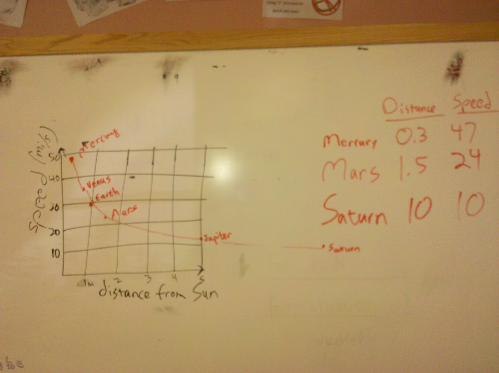
To bolster the argument that these are the same force, we should look not just at the direction, but also the strength. I had the kids whirl the tennis ball on a string at various speeds, and feel whether the higher speed requires more force, less force, or the same force (the answer is more). So let's look at the planets' speeds around the Sun and see if we can relate that to the force of gravity. I asked the kids for suggestions as to what would affect the planet speed. The two main suggestions were planet size, and planet distance from the Sun. It would have been great to investigate both of these possibilities, but we were running short on time so we just did planet distance from the Sun. I had the kids make graphs of planet speed vs planet distance from the Sun. We took our time doing this right, figuring out how to draw the axes with reasonable scales, and adding planets one by one, starting with the most familiar ones.
A pattern did emerge: more distant planets are slower, as the graph below shows.

By our tennis ball experiment, slower circular motion implies a weaker pull (less acceleration). Therefore this graph implies that more distant planets feel a weaker pull, and planets closer to the Sun feel a stronger pull. Does this make sense if the Sun's gravity is what keeps the planets from flying off in straight-line paths? The kids agreed that it did.
[If we had also made the graph of speed vs planet size, we would not have seen such a clear pattern. It happens that the outer planets tend to be bigger, so that there would be a tendency for bigger planets to be slower, but it would only be a tendency, not a law, because the biggest planet happens to be the nearest (fastest) of the outer four. And the pattern would really be broken if we also included Pluto, which is a very distant (hence very slow), small object, providing a counterexample to the fast inner planets which happen to be small and which therefore might give someone the false impression that small means fast.]
I liked this 40-minute activity and I think it worked well. I did simplify some details to avoid getting bogged down (eg the distinction between force and acceleration), but I think it was appropriate for 3-4 graders who wanted to focus on astronomy rather than physics. We also got in some more practice with graphs, which is important. And we learned something which in Newton's time was revolutionary: the same laws of physics which we can deduce here on Earth also apply to objects in the sky. This was one of the most wonderful discoveries in the history of science, and it's what allows us to understand the universe.
I reviewed some ideas about motion we had discussed last year. If you roll a marble, you expect it to go in a straight line unless something (another kid, perhaps, or a wall) interferes by pushing (exerting a force) on the marble. That's Newton's first law of motion. I then put a donut on a string and spun the donut in a circle over my head. What will happen if the string is cut? Will the donut continue in a circle, fly off in a straight line, or fly off in a curve? We took a vote. I always clarify that the question is about what happens immediately, not about what happens eventually, like the donut falling due to the gravity in the room. This means that when we do the experiment, they have to really pay attention!
In reality I don't cut the string, but the string pulls through the soft donut, and it flies off in a straight line---Newton's first law again. This is a pretty vivid demonstration that the Moon wouldn't keep going around the Earth, nor the planets around the Sun, unless there was a force keeping them from flying off in a straight line. Kids this age already know that we call that force gravity, but gravity is also the force that makes things fall when I drop them. Why do we call these two forces by the same name?
I also have a tennis ball on a string so I can demonstrate circular motion as much as needed. I do this and ask the kids what direction the force must be in. It must be towards the center of the circle, where my fist is holding the string. That's clear because the only direction a string can exert a force is pulling along the string! So whatever force is pulling on the Moon, it must be pointed toward the center of the Earth. And that's exactly what we observe about gravity on Earth! (It helps to draw an Earth and how the arrow of gravity points in your location vs in, say, Australia.) So it's quite plausible that these two forces are really the same force.
To bolster the argument that these are the same force, we should look not just at the direction, but also the strength. I had the kids whirl the tennis ball on a string at various speeds, and feel whether the higher speed requires more force, less force, or the same force (the answer is more). So let's look at the planets' speeds around the Sun and see if we can relate that to the force of gravity. I asked the kids for suggestions as to what would affect the planet speed. The two main suggestions were planet size, and planet distance from the Sun. It would have been great to investigate both of these possibilities, but we were running short on time so we just did planet distance from the Sun. I had the kids make graphs of planet speed vs planet distance from the Sun. We took our time doing this right, figuring out how to draw the axes with reasonable scales, and adding planets one by one, starting with the most familiar ones.
A pattern did emerge: more distant planets are slower, as the graph below shows.
By our tennis ball experiment, slower circular motion implies a weaker pull (less acceleration). Therefore this graph implies that more distant planets feel a weaker pull, and planets closer to the Sun feel a stronger pull. Does this make sense if the Sun's gravity is what keeps the planets from flying off in straight-line paths? The kids agreed that it did.
[If we had also made the graph of speed vs planet size, we would not have seen such a clear pattern. It happens that the outer planets tend to be bigger, so that there would be a tendency for bigger planets to be slower, but it would only be a tendency, not a law, because the biggest planet happens to be the nearest (fastest) of the outer four. And the pattern would really be broken if we also included Pluto, which is a very distant (hence very slow), small object, providing a counterexample to the fast inner planets which happen to be small and which therefore might give someone the false impression that small means fast.]
I liked this 40-minute activity and I think it worked well. I did simplify some details to avoid getting bogged down (eg the distinction between force and acceleration), but I think it was appropriate for 3-4 graders who wanted to focus on astronomy rather than physics. We also got in some more practice with graphs, which is important. And we learned something which in Newton's time was revolutionary: the same laws of physics which we can deduce here on Earth also apply to objects in the sky. This was one of the most wonderful discoveries in the history of science, and it's what allows us to understand the universe.
Friday, May 31, 2013
Light and Telescopes
In the second half of this morning's activities with the 3-4 graders, we discovered some things about light and telescopes. I handed out diffraction gratings and we looked at the spectrum of the Sun and of the fluorescent lights in the room, discovering that white light is actually composed of many colors. We also looked at discharge tubes filled with different elements, with mercury and helium being the stars. We found that each element emits a unique "fingerprint" of spectral lines. To see a great 2-minute video of everything the kids saw, check this out. This is how we know what stars and other planets are made of.
We then discussed how the colors always appear in a certain order in a rainbow or a diffraction grating: red, orange, yellow, green, blue, violet. Could there be any light which appears before red? Yes, it's called infrared, and we can build cameras to see it even though our eyes can't. I showed this nice video demonstrating the properties of infrared light. Could there be any light which appears after violet? Yes, ultraviolet, and after that would be X-rays and finally gamma rays. We talked about X-rays for a while because some kids were worried about it being dangerous. (Like many other things, they are safe if used properly, but dangerous if not. A yearly dental X-ray is ok, but how do we protect the parts of our bodies which don't need to be X-rayed? And how do we protect the workers who administer dozens of X-rays each day?) I extended that discussion to the ultraviolet and sunlight.
All this was a springboard for discussing telescopes, which is one of the last astronomy standards I hadn't covered yet. Specialized telescopes are built to look at all kinds of light, from gamma rays to the infrared and radio. I showed pictures of some of the big telescopes I have used in my research, and that led to all kinds of interesting questions. We ran out of time, so I may start next Friday by answering more telescope questions.
Scale Model Solar System Complete!
This morning I guided the 3-4 graders through assembling our scale model solar system. I wanted them to really think about how to make a scale model, so I returned to each student the graph they had made last time and I asked them to use the graph to figure out where they would put their planet, given that I had put Teacher Moné's beautiful Earth poster 2.5 meters from the Sun poster. Of course, I found that I needed to break this task into smaller chunks for them to process. We began by revisiting some of the steps we had done last week. Each child identified his/her planet on the graph, read its distance off the graph, and then we thought about what that distance means. For example, Jupiter is at a distance of 5 on the graph. Five what? The graph doesn't say. But the graph itself is a scale model of the solar system. We don't really care what the actual distance is because we are simply stretching this scale model to become a larger scale model which will fill the school. All we need to do is choose a reference point and stretch everything else accordingly. The graph made this easy because it shows Earth as being at a distance of 1. So if Jupiter is at 5, we simply need to put Jupiter 5 times farther from the Sun than Earth is from the Sun; in other words 5x2.5 meters or 12.5 meters.
To help the kids visualize this, I took a rubber band and marked three dots on it, representing Sun, Earth, and Jupiter. This is a scale model much like the graph (if we ignore the vertical dimension of the graph). If I stretch the rubber band, will Jupiter still be 5 times more distant from the Sun than the Earth is from the Sun? Some kids said no and some said yes, so we took a vote. Having to commit to a vote made the kids think harder and they voted overwhelmingly yes. After the vote I did stretch the rubber band and I did get a bigger scale model. In principle, if we got a really long rubber band, I could mark all the planets' distances at the scale of the graph and then stretch it out to get a giant scale model as big as the school, and that would tell us where to put each planet poster. But since that's impractical, we do the math instead.
This seems to have been more or less the right level of conceptual challenge and the right level of math for the kids. They found it a bit of a challenge, but a doable one that became satisfying rather than frustrating. After looking over each child's computation, we practiced some metacognition. Alex was concerned that his number didn't make sense given what he knew about the relative positions of the Sun, Earth and Venus. It turned out that he was misinterpreting his number as the Earth-Venus distance, but the point was a really important one: always check that your numerical results make sense! I have had so many students make a mistake punching numbers into a calculator, and get a number that obviously doesn't make sense given a moment's thought, but blithely write down the number as if any number displayed by a calculator must be correct. In this case we wrote out the multiplication rather than use a calculator, but the same principle applies: check that the results actually make sense! This goes not only for numbers that you compute, but also for numbers that other people compute for you.
An especially effective way to double-check your number is to perform some completely different procedure; if you just perform the original procedure again, you may easily make the same mistake again. So I thought of a way we could all check our numbers without recomputing anything. I made a list of the students' results, starting with the closest planet and proceeding outward. If the distance numbers didn't increase steadily, that would be a smoking gun indicating a mistake. And we did find a mistake this way, so it was instructive.
Once we had our final numbers, we split into groups to measure off the distances and attach the posters to the walls. We couldn't quite fit Neptune into the school grounds, and Orcus wasn't even close, but we put them up at the far end with a note saying where they should really be. Even after choosing a scale so large that the orbit of Neptune was just outside the fence, the sizes of the planets are really small, smaller than a grain of sand for most planets. Even Jupiter is only 2.4mm across. Space is really big!
Looking at the finished product, I am really happy we did it and spent enough time on it to do it right. We certainly appreciate the solar system much better now, but we also learned new ways of thinking.
Friday, May 24, 2013
Planet Posters
Two weeks ago each student chose a planet (or other solar system object) to research and make a poster about. Today they brought in their posters, and each student told the class what they learned in their research. The kids were very engaged and asked so many good questions that we spent all morning doing this. So next week we will put up the posters at the appropriate distances from the Sun poster (which I made and put up near the school entrance today) to make a scale model of the solar system. The discussions today were so full, frank, and wide-ranging that I can't hope to capture them in a blog post. I will simply leave you with a short video with amazing images of Jupiter's moon Europa.
I think the posters were quite successful as a learning experience. The kids learned by researching and making them, but they also learned by listening to other kids talk about their posters, and they all learned when I answered numerous questions in more depth as they arose. I think a key to real learning is that the posters should not be just a laundry list of facts, but should really be based on the students' questions. When I issued the assignment, I offered some questions they might be interested in answering:
I think the posters were quite successful as a learning experience. The kids learned by researching and making them, but they also learned by listening to other kids talk about their posters, and they all learned when I answered numerous questions in more depth as they arose. I think a key to real learning is that the posters should not be just a laundry list of facts, but should really be based on the students' questions. When I issued the assignment, I offered some questions they might be interested in answering:
- What would it be like to visit? What is the temperature? Is there a solid surface? Would the Sun look bright from that distance? If the temperature is extreme, think about ways to convey how extreme it is.
- Does the planet have moons or rings? If you chose a moon to begin with, briefly describe the host planet.
- What are seasons like on that planet? This depends on how tilted the planet is with respect to its orbit.
- How long is the year on that planet? How long is a day?
- Are there volcanoes? Rocks? Rivers/lakes/oceans? (If so, are they made of water or some other substance? Moons of Jupiter and Saturn are especially interesting in this respect.) Clouds? Earthquakes? Storms? Lightning?
- Could you possibly find life there?
Our Solar System, Graphs, and Classification Schemes
Following the previous week's intro to the solar system, on Friday May 17 I visited the 3-4 grade room and used the solar system as a context for practice with graphs. We used the graphs in turn as a tool for helping us think about how to classify solar system objects. By establishing several clearly different classes of solar system objects, we raised questions about how the solar system might have formed these different classes, and we even began to answer those questions. I think this worked quite well as a coherent activity while asking the students to practice a variety of skills.
The centerpiece was a graph (technically a scatterplot*) of size vs distance from Sun for various solar system objects. My first idea was to help the kids make their own graphs from a table of data, but I discarded that idea as requiring too much time before we got to any science. So I made this graph and handed out a copy to each student:

I still wanted students to graph some data, so I planned to make them analyze and understand this graph as a gateway to getting them to add more points and do more analysis. I think this plan went well. I started with the question: can you identify any of the points? This required them to think about the meaning of the axes, and once they understood, they started saying things like "the top one must be Jupiter, because it's the biggest planet" and "the one most to the right must be Neptune because it's most distant from the Sun." Once they grasped that, they were able to label more and more points until we eventually got them all. (The word "eventually" hides a lot of time spent one-on-one with kids, helping them with the reasoning. Eg, Earth and Venus are almost exactly the same size, but Earth is a bit bigger, so which point is Earth? Double-check your conclusion by looking at distance from the Sun. Does it make sense? Etc.)
This was an excellent activity to make them think about the meaning of the graph rather than getting caught up in big numbers which wouldn't mean much to them anyway. (Jupiter is 90,000 miles across? How big is that?) But now let's think about the numbers. The graph says Earth's distance from the Sun is 1. What is that? One foot? One billion miles? The only unit that makes sense is units of "Earth-Sun distance." In other words, the graph makes it easy to read off the relative distances of the planets. It's a scale model. Again, this makes it easy to think about what the solar system is without getting caught up in a bunch of meaningless numbers. We repeated that exercise with the vertical axis.
Then we looked at whether the planets form any distinct groups. The graph makes it clear that there are two groups: small and close to the Sun, vs large and far from the Sun. What other differences might these groups have? It turns out that the large ones are made of different stuff (mostly gas vs rock), so maybe we should really think of two types of planets (gas giants and rocky planets) rather than thinking that all things called "planet" are similar things.
Next, I took them back to the year 1801 when a new planet was discovered: Ceres. I gave them the Ceres-Sun distance in units of the Earth-Sun distance (2.77) and Ceres' size in Earth-size units (0.07) and asked them to put Ceres on the graph. For the faster students, I gave them three more planets which were discovered soon after Ceres (Pallas**, Juno, and Vesta, which have similar distances and sizes) while the teachers helped the slower students with the graphing. After graphing these, it's clear that they form a distinct group: a group of very small things between Mars and Jupiter. Today we call these things main-belt asteroids, but when they were discovered they were simply called new planets. It was only after discovering many of them that people began to think that maybe we shouldn't call all new discoveries planets, and especially not these new discoveries which clearly form a separate group. The way we think about things is highly dependent on how much information we have.
This took until the break. After the break, we added Pluto to the graph. When Pluto was discovered, it was immediately called a planet because it was much larger than any asteroid, and there was no other category it could have been assigned to. But it does seem a bit out of place on the graph, being substantially smaller than any of the eight planets we started with, and also breaking the pattern of the larger planets being farther from the Sun. Well, it took 60 years, but eventually astronomers started discovering lots of other things roughly as far from the Sun and roughly the same size. I gave the kids data for these new objects: Eris, Sedna, Quaoar, and Orcus to start with.
Just as with the asteroids, it became clear that things like Pluto form a new category: the Kuiper Belt. This is even more clear when we realize that all these things are made of ices***, which is not like the inner planets or the outer planets. Once this new category was recognized, it became silly to continue calling Pluto a planet, just as in the 1800's it became silly to continue calling Ceres, Pallas, Juno, and Vesta planets. Perhaps Pluto should have been in a category of its own from the start, but there was no available category other than "planet," and why create a new category just for one object? Another illustration that the way we think about things depends on how much information we have.
[A side note: astronomers created the additional category "dwarf planet" to describe a body which, regardless of its location, is large enough that its gravity pulls it into a round shape (but smaller than the eight planets). Thus Pluto is both a Kuiper Belt object and a dwarf planet just as I am both a teacher and a father---they are not exclusive categories. But "Kuiper Belt object" is a much more descriptive term because it implies being made of ice, being a certain distance from the Sun, etc, whereas "dwarf planet" implies only that the size is neither very large nor very small.]
Next, we talked about how the solar system might have formed in order to form these different classes of objects. I showed clips from the Birth of the Earth episode of the series How the Earth Was Made. It has some really nice visualizations, and it is constructed around evidence, which is a key feature missing from most science documentaries. It tells science like the detective story it is. We spent probably half an hour on this, but I won't write much here because it's already a long blog post.
To cap off this intense morning, I brought some liquid nitrogen to demonstrate how cold the outer planets are. I froze a racquetball and shattered it just by trying to bounce it off the floor; I froze a banana and showed how it can be used as a hammer (until it shattered), and I made a balloon shrink and then expand again as I warmed it up. LN2 is always a great hit with the kids. On Pluto summers can be just warm enough to vaporize some nitrogen, but right about now Pluto is in early fall, and it will get so cold that nitrogen will not only liquify, it will freeze.
**I got the idea for some of this activity when I saw that the element palladium was so named because for a long time it was fashionable to name newly discovered elements after recently discovered planets. I was long aware of uranium, neptunium, and plutonium being named this way, but I had never made the connection to cerium and palladium. People really thought that asteroids were planets until enough asteroids were discovered.
***Ices includes ice made of materials other than water, such as methane, ammonia, etc.
The centerpiece was a graph (technically a scatterplot*) of size vs distance from Sun for various solar system objects. My first idea was to help the kids make their own graphs from a table of data, but I discarded that idea as requiring too much time before we got to any science. So I made this graph and handed out a copy to each student:

I still wanted students to graph some data, so I planned to make them analyze and understand this graph as a gateway to getting them to add more points and do more analysis. I think this plan went well. I started with the question: can you identify any of the points? This required them to think about the meaning of the axes, and once they understood, they started saying things like "the top one must be Jupiter, because it's the biggest planet" and "the one most to the right must be Neptune because it's most distant from the Sun." Once they grasped that, they were able to label more and more points until we eventually got them all. (The word "eventually" hides a lot of time spent one-on-one with kids, helping them with the reasoning. Eg, Earth and Venus are almost exactly the same size, but Earth is a bit bigger, so which point is Earth? Double-check your conclusion by looking at distance from the Sun. Does it make sense? Etc.)
This was an excellent activity to make them think about the meaning of the graph rather than getting caught up in big numbers which wouldn't mean much to them anyway. (Jupiter is 90,000 miles across? How big is that?) But now let's think about the numbers. The graph says Earth's distance from the Sun is 1. What is that? One foot? One billion miles? The only unit that makes sense is units of "Earth-Sun distance." In other words, the graph makes it easy to read off the relative distances of the planets. It's a scale model. Again, this makes it easy to think about what the solar system is without getting caught up in a bunch of meaningless numbers. We repeated that exercise with the vertical axis.
Then we looked at whether the planets form any distinct groups. The graph makes it clear that there are two groups: small and close to the Sun, vs large and far from the Sun. What other differences might these groups have? It turns out that the large ones are made of different stuff (mostly gas vs rock), so maybe we should really think of two types of planets (gas giants and rocky planets) rather than thinking that all things called "planet" are similar things.
Next, I took them back to the year 1801 when a new planet was discovered: Ceres. I gave them the Ceres-Sun distance in units of the Earth-Sun distance (2.77) and Ceres' size in Earth-size units (0.07) and asked them to put Ceres on the graph. For the faster students, I gave them three more planets which were discovered soon after Ceres (Pallas**, Juno, and Vesta, which have similar distances and sizes) while the teachers helped the slower students with the graphing. After graphing these, it's clear that they form a distinct group: a group of very small things between Mars and Jupiter. Today we call these things main-belt asteroids, but when they were discovered they were simply called new planets. It was only after discovering many of them that people began to think that maybe we shouldn't call all new discoveries planets, and especially not these new discoveries which clearly form a separate group. The way we think about things is highly dependent on how much information we have.
This took until the break. After the break, we added Pluto to the graph. When Pluto was discovered, it was immediately called a planet because it was much larger than any asteroid, and there was no other category it could have been assigned to. But it does seem a bit out of place on the graph, being substantially smaller than any of the eight planets we started with, and also breaking the pattern of the larger planets being farther from the Sun. Well, it took 60 years, but eventually astronomers started discovering lots of other things roughly as far from the Sun and roughly the same size. I gave the kids data for these new objects: Eris, Sedna, Quaoar, and Orcus to start with.
Just as with the asteroids, it became clear that things like Pluto form a new category: the Kuiper Belt. This is even more clear when we realize that all these things are made of ices***, which is not like the inner planets or the outer planets. Once this new category was recognized, it became silly to continue calling Pluto a planet, just as in the 1800's it became silly to continue calling Ceres, Pallas, Juno, and Vesta planets. Perhaps Pluto should have been in a category of its own from the start, but there was no available category other than "planet," and why create a new category just for one object? Another illustration that the way we think about things depends on how much information we have.
[A side note: astronomers created the additional category "dwarf planet" to describe a body which, regardless of its location, is large enough that its gravity pulls it into a round shape (but smaller than the eight planets). Thus Pluto is both a Kuiper Belt object and a dwarf planet just as I am both a teacher and a father---they are not exclusive categories. But "Kuiper Belt object" is a much more descriptive term because it implies being made of ice, being a certain distance from the Sun, etc, whereas "dwarf planet" implies only that the size is neither very large nor very small.]
Next, we talked about how the solar system might have formed in order to form these different classes of objects. I showed clips from the Birth of the Earth episode of the series How the Earth Was Made. It has some really nice visualizations, and it is constructed around evidence, which is a key feature missing from most science documentaries. It tells science like the detective story it is. We spent probably half an hour on this, but I won't write much here because it's already a long blog post.
To cap off this intense morning, I brought some liquid nitrogen to demonstrate how cold the outer planets are. I froze a racquetball and shattered it just by trying to bounce it off the floor; I froze a banana and showed how it can be used as a hammer (until it shattered), and I made a balloon shrink and then expand again as I warmed it up. LN2 is always a great hit with the kids. On Pluto summers can be just warm enough to vaporize some nitrogen, but right about now Pluto is in early fall, and it will get so cold that nitrogen will not only liquify, it will freeze.
Notes
*Notice that this graph is not a histogram, which seems to be the only type of graph elementary teachers ever work with. I see that kids start working with graphs around second grade if not earlier, so by the time they get to college, they should be highly proficient. But in my college classes that students are typically far from proficient. My guess is that much of the time spent on graphs in school is wasted because students are never introduced to the idea of graphing the relationship between two different abstract quantities, which is absolutely key to data analysis and science.**I got the idea for some of this activity when I saw that the element palladium was so named because for a long time it was fashionable to name newly discovered elements after recently discovered planets. I was long aware of uranium, neptunium, and plutonium being named this way, but I had never made the connection to cerium and palladium. People really thought that asteroids were planets until enough asteroids were discovered.
***Ices includes ice made of materials other than water, such as methane, ammonia, etc.
Friday, May 10, 2013
Solar system
Today we blasted off from our Earth-Moon base and explored the other planets. I started with this image of the terrestrial planets, which accurately depicts their relative sizes but not their distances. I brought in a big yoga ball to represent the Sun and we went in order from the Sun (ie from the left in that image). For each planet I elicited what they already knew or thought they knew about each planet, and then enriched it as best I could. For example, they knew Mercury is hot because it's close to the Sun...but what about the side away from the Sun (ie the night side, which is not always the same side)? It is actually very cold; why would that be? To put it another way, why is the day/night temperature variation on Earth not very extreme? That led to a discussion of atmospheres, which further led to a discussion of cratering, which further led to comparisons between Mercury and our Moon (similar size, both airless and cratered, extreme day/night temperature variation). I won't try to document each planet's discussion here, but 45 minutes flew by. (Here are links to a similar image comparing some asteroids in the asteroid belt, one comparing the gas giant planets (aka Jovian planets) and an image comparing the dwarf planets outside Neptune's orbit.) As we went, I filled in a table of planet sizes (diameters) and distances from the Sun, for later reference. I rounded the numbers quite a bit so kids would more easily see the comparisons. For example, rounding the Sun's diameter to 800,000 miles and Earth's to 8,000 we easily see that the Sun is about 100 times bigger across. This is way easier to understand than listing the exact numbers and doing the exact computation to find that it is 109 times bigger across.
Just before the break, I addressed why Pluto is no longer considered a planet. Short answer: it became clear that Pluto was just one of many smallish iceballs which are very unlike terrestrial planets and also very unlike Jovian planets, so they deserve their own class. When Pluto was the only known example, it didn't occur to anyone to put it in its own class. A nice example of how the way we classify things can change as we get more data.
After the break, we worked on understanding the distances and sizes by building scale models. First, we did the pocket solar system to understand the relative distances. It's quite amazing to see how relatively jam-packed the inner solar system is compared to the outer solar system, yet even in the inner solar system there are many tens of millions of miles between planets.
Next, the sizes. With the 65-cm-diameter yoga ball as the Sun, I pulled balls of various sizes out of my box: softball, baseball, tennis ball, ping-pong ball, etc. Because I had two ping-pong balls, students suggested they could be Earth and Venus, which are nearly the same size. Does this accurately depict how much smaller than the Sun these two planets are? Well, Earth is 100 times smaller than the Sun, so on this scale it should be 0.65 cm across, or 6.5mm (1/4 inch). That's way smaller than a ping-pong ball, so I had to rummage around in my kit, where I found some allspice. Allspice varies in size, but we did find some which were 6mm across. That's right, if the Sun is a yoga ball, Earth is the size of an allspice!
Whenever we do a calculation, we have to double-check it. I held up the yoga ball and the allspice and asked the kids if they thought 100 allspice would fit across the yoga ball. Yes, it looks about right. Out of curiosity, how many would fit in the yoga ball? Some of them guessed 100x100, because the yoga ball is 100x bigger in each of the two dimensions which are easily seen. But the yoga ball is also 100x bigger in the third dimension, so its volume is 100x100x100 or 1,000,000 (a million) times bigger. One million Earths could fit into the volume of the Sun. (The Sun's density is a bit less than Earth's, so the Sun's mass is "only" 318,000 times bigger than Earth's. For older kids, adding density and mass to this whole discussion might make sense.)
OK, so now we have Earth and Venus. What about Jupiter? Using the same reasoning, we found a ball about Jupiter's size (a small whiffleball, not much bigger than a ping-pong ball), and Saturn is just a bit smaller. Uranus and Neptune could be represented by small marbles. Mars could be a small allspice or an average peppercorn, and Mercury could be a mustard seed. Amazing! (If you're a teacher who would like to do this kind of activity, check out the peppercorn Earth website for some supporting materials.)
Finally, if these are the sizes of the planets in our scale model, what are the distances between planets? The Earth-Sun distance is about 100 Sun diameters, so we need 65 meters or about 200 feet. That's about the distance from our classroom to the far side of the playground. Jupiter is 5 times farther, so maybe we could put it at the KFC a block or so away. Pluto is 40 times further than Earth from the Sun, so that would be 8,000 feet or 1.6 miles, the distance from school to home for some of the kids. Imagine...all that space in between would be empty. Even Mercury, closest to the Sun, would be about 80 feet away and the size of a mustard seed!
At the end, I asked the students to choose a favorite planet or moon, learn more about it, and make a poster over the next two weeks. We'll put the posters up all over school at the appropriate distances to make a scale model. At the center of each poster will be a small object size to match the scale model. To fit the scale model into the school, some of them will have to be very small objects, like a grain of sand. Teacher Brittany will work with the students on the math for that, and I'll report back on the scale model in a few weeks.
Wednesday, May 8, 2013
Earth, Moon, Sun
Last Friday I had my second astronomy session with the 3-4 graders. In the first one, we spent a lot of unplanned time on why we don't feel the Earth moving, and also it had been 3 weeks since my last visit, so I spend the first block of time recapping how we know the Earth rotates and how we know the cause of the seasons, and building on that to analyze the Earth-Sun motion.
Do we go around the Sun or does it go around us? We know that one of these two things is happening, because a given star rises at intervals of 23 hours and 56 minutes, whereas the Sun does at 24-hour intervals. (Maven alert: 24 hours is an average which varies with the seasons, but that's too much detail here.) So each day the Sun gets 4 minutes "behind" the stars and over the course of a year it appears to make a complete circuit around the sky relative to the stars. Ancient people knew this without having accurate clocks; they simply observed that the stars they could see at night (ie when the Sun was below the horizon) shifted slowly throughout the year. We also know (as a boy mentioned last time) that the Sun's apparent size varies slightly throughout the year, thus indicating that our distance from the Sun varies slightly throughout the year. [We happen to be closest to the Sun in January; if this shocks you, read about the cause of the seasons.]
I drew two models on the board: one with the Sun going around us in an ellipse (thus varying the distance) and the other with Earth going around the Sun in an ellipse. What would be the observable differences between these two scenarios? This is a tough question!
Think about sitting in a moving car. The roadside trees appear to rush by, but the distant mountains appear to move very slowly. If the Earth moves, we ought to be able to see an effect like this by comparing nearby and distant stars. I had taped some stars around the room and we had a small circular carpet to orbit around, so we practiced that. You could also do this activity in the schoolyard. This effect is called parallax; if Earth is still, we will not see it. The ancient Greeks thought of this, they looked for parallax and didn't see it, so they leaned toward Earth being still. It turns out that even the nearest stars are so far away that the parallax effect is tiny, and was not measured until modern times. So the ancient Greeks were not at all ignorant; they just didn't have precise enough tools to measure this really small effect.
It turns out that the nearest star is about 250,000 times more distant than the Earth-Sun distance, ie the distance which Earth moves. It's as if your car moved one mile but you were asked to discern the difference in your view of mountains 250,000 miles away (eg, on the Moon). I illustrated this dramatically by asking the kids to drawing a one-inch Earth-Sun model on the board, and then drawing a long line representing the distance to the next star and asking the kids to stop me when they thought I had arrived. Kids (even most adults) have no idea how much 250,000 times is; they ask me to stop after 5 feet or so, but I keep going. When I run out of board, I get a roll of toilet paper and start unrolling it, as a way to illustrate a very long line. I keep going even when they tell me to stop. Then, when I run out of toilet paper, I go to the back room and get a cart full of hundreds of rolls of toilet paper! It is really dramatic and fun. I also wrote out the number of miles to the next nearest star on the board: about 24,000,000,000,000 miles. (Kids and even most adults have little idea what a "trillion" really means.)
Knowing these distances, we can answer a few questions about the nature of the Sun and stars. Lights which are further away appear to be fainter, so if we compensate for the enormous distance of the stars, we find that their intrinsic brightness (aka luminosity) is about the same as the Sun. The Sun is just another star! And we can compute that luminosity in terms of watt, just like a light bulb. The Sun's luminosity turns out to be 400,000,000,000,000,000,000,000,000 watts. It is the ultimate source of nearly all the energy we use on Earth. If it burned fuel like coal or oil to produce its energy, it would rapidly run out of energy. Astronomers were stumped for years on what the source of energy could be, until they discovered nuclear fusion (which we may address in more detail next time).
After the break, we looked at kids' observations of the Moon over the past three weeks, and we figured out what model could explain these observations, using as many different ways as possible: kinesthetic activity, going into a dark room with a blacklight and ping-pong balls so each student could move the "Moon" around his/her own head; and a mechanical model I had borrowed. I really think all these ways (and more) are necessary for most people to really get it. I don't have time to write up this activity now, but if you are interested there are plenty of internet resources to help you understand it. I just want to say that the kids' own observations over the previous three weeks were key to demolishing the misconceptions that the Moon is only visible at night, and/or that the Moon is always visible at night. Finally, I want to leave you with some insanely cool pictures of eclipses.

This one shows the Moon at three different times throughout a lunar eclipse (when Earth's shadow falls on the Moon). The ancient Greeks were able to determine from this that the Moon is about 1/4 the diameter of Earth, or about 2000 miles across. Furthermore, they know that for a 2,000-mile-diameter object to look as small as the Moon looks to us, it would have to be about 240,000 miles away.
Do we go around the Sun or does it go around us? We know that one of these two things is happening, because a given star rises at intervals of 23 hours and 56 minutes, whereas the Sun does at 24-hour intervals. (Maven alert: 24 hours is an average which varies with the seasons, but that's too much detail here.) So each day the Sun gets 4 minutes "behind" the stars and over the course of a year it appears to make a complete circuit around the sky relative to the stars. Ancient people knew this without having accurate clocks; they simply observed that the stars they could see at night (ie when the Sun was below the horizon) shifted slowly throughout the year. We also know (as a boy mentioned last time) that the Sun's apparent size varies slightly throughout the year, thus indicating that our distance from the Sun varies slightly throughout the year. [We happen to be closest to the Sun in January; if this shocks you, read about the cause of the seasons.]
I drew two models on the board: one with the Sun going around us in an ellipse (thus varying the distance) and the other with Earth going around the Sun in an ellipse. What would be the observable differences between these two scenarios? This is a tough question!
Think about sitting in a moving car. The roadside trees appear to rush by, but the distant mountains appear to move very slowly. If the Earth moves, we ought to be able to see an effect like this by comparing nearby and distant stars. I had taped some stars around the room and we had a small circular carpet to orbit around, so we practiced that. You could also do this activity in the schoolyard. This effect is called parallax; if Earth is still, we will not see it. The ancient Greeks thought of this, they looked for parallax and didn't see it, so they leaned toward Earth being still. It turns out that even the nearest stars are so far away that the parallax effect is tiny, and was not measured until modern times. So the ancient Greeks were not at all ignorant; they just didn't have precise enough tools to measure this really small effect.
It turns out that the nearest star is about 250,000 times more distant than the Earth-Sun distance, ie the distance which Earth moves. It's as if your car moved one mile but you were asked to discern the difference in your view of mountains 250,000 miles away (eg, on the Moon). I illustrated this dramatically by asking the kids to drawing a one-inch Earth-Sun model on the board, and then drawing a long line representing the distance to the next star and asking the kids to stop me when they thought I had arrived. Kids (even most adults) have no idea how much 250,000 times is; they ask me to stop after 5 feet or so, but I keep going. When I run out of board, I get a roll of toilet paper and start unrolling it, as a way to illustrate a very long line. I keep going even when they tell me to stop. Then, when I run out of toilet paper, I go to the back room and get a cart full of hundreds of rolls of toilet paper! It is really dramatic and fun. I also wrote out the number of miles to the next nearest star on the board: about 24,000,000,000,000 miles. (Kids and even most adults have little idea what a "trillion" really means.)
Knowing these distances, we can answer a few questions about the nature of the Sun and stars. Lights which are further away appear to be fainter, so if we compensate for the enormous distance of the stars, we find that their intrinsic brightness (aka luminosity) is about the same as the Sun. The Sun is just another star! And we can compute that luminosity in terms of watt, just like a light bulb. The Sun's luminosity turns out to be 400,000,000,000,000,000,000,000,000 watts. It is the ultimate source of nearly all the energy we use on Earth. If it burned fuel like coal or oil to produce its energy, it would rapidly run out of energy. Astronomers were stumped for years on what the source of energy could be, until they discovered nuclear fusion (which we may address in more detail next time).
After the break, we looked at kids' observations of the Moon over the past three weeks, and we figured out what model could explain these observations, using as many different ways as possible: kinesthetic activity, going into a dark room with a blacklight and ping-pong balls so each student could move the "Moon" around his/her own head; and a mechanical model I had borrowed. I really think all these ways (and more) are necessary for most people to really get it. I don't have time to write up this activity now, but if you are interested there are plenty of internet resources to help you understand it. I just want to say that the kids' own observations over the previous three weeks were key to demolishing the misconceptions that the Moon is only visible at night, and/or that the Moon is always visible at night. Finally, I want to leave you with some insanely cool pictures of eclipses.
 |
| This is a picture of the Moon's shadow falling on Earth during a solar eclipse. |

Thursday, April 25, 2013
Picnic Day
UC Davis Picnic Day is a giant open house attended by 50,000 or more
people. The Physics Club runs a "magic show" and a demo room where
visitors can do some hands-on experiments, but there hasn't been a
kid-friendly physics room in the past. This year, I decided to make
one with the help of kids and parents at Peregrine School. The day
before Picnic Day, I brought all my toys (Coriolis effect demo,
balloon in a bottle, infrared camera, mixing colors of light,
airzooka, etc) to the school and spent the morning training students
and parents so they would be able to explain the ideas behind them to
visitors on Picnic Day. On Friday night my wonderful wife Vera and I
set the demos up in a room on campus, and on Saturday we had a ton of
visitors.
I think we did a really good thing here. We didn't have our kids
explaining physics to other kids as much as I had imagined, for
various reasons: our kids were having fun playing too; they wanted to
visit other exhibits on Picnic Day; and most of the visitors to our
room were actually adults. So the kids got less practice in
explaining physics than I had imagined, but we did a great public
service. As an educator, I'm always thinking about ways to tweak
things, so if there is a next time (or as advice to others thinking
about doing this kind of thing), one way to get kids really deeply
invested might be to have them develop their own unique demos.
Thursday, April 18, 2013
There is a season
At the end of last Friday's session with the 3-4 graders we discussed
the seasons. It's natural to think that winter is when we are farther
from the Sun, but is that true? What evidence can we reason with
here?
Well, for one, we know that when it's winter in the northern
hemisphere, it's summer in the southern hemisphere. That's a pretty
good clue that the seasons are not caused by the Earth getting closer
to and farther from the Sun. What else? One boy, to my amazement,
specifically mentioned that if/when we are closer to the Sun, it
should appear to be bigger, and it doesn't appear to be bigger in
(northern) winter. I was pretty surprised, but then I recalled that
he had recently seen the movie Agora. This is a trenchant
observation: the Sun actually looks smallest (as seen from anywhere on
Earth) in January, indicating that January is when Earth is furthest
from the Sun. (You can't see this just by looking, because the Sun is
so blindingly bright and it's a fairly small change, but you can use a
pinhole camera to do it.)
Most people (these kids included) "know" that seasons are caused by
"tilt," but what does that really mean? It's very useful to take a
globe (on a standard stand tilted by the right amount) and make it
orbit a light source to see how this plays out. The tilt actually
points to the same place in the sky (judging by the stars) all the
time, but since Earth goes around Sun (or vice versa, it doesn't
matter for this point), for part of the orbit the tilt points the
north pole toward the Sun. This is northern summer, when there is
midnight Sun near the north pole, and longer daylight hours in
northern latitudes generally. (You can see this by spinning the globe
in the aforementioned model. Make sure to keep the north pole always
pointing toward the same place in the room, like the clock on the wall,
even as it goes around the "Sun.") Six months later, the Sun is on the
opposite side of Earth (relative to the stars) so it's the south's
turn to have summer and the north pole has constant darkness. In
between those two extremes, neither hemisphere is favored.
So we are NOT tilted closer to the Sun. The tilt merely allows the
Sun to shine a greater or lesser fraction of the time on a certain
hemisphere, depending on where the Sun is relative to this constant
tilt. (This fits the evidence that whatever hemisphere has summer, it
does not see the Sun as closer and bigger.) Translated into what we
see on the ground, it means that summer is when the Sun rises earlier
and sets later, and goes higher in the sky at noon. You can see all
these things with the globe and light setup. I had had the kids keep
a sketch of the position and time of sunset or sunrise each week for
the past six weeks, and these data match the model I just described.
I'll analyze that in a bit more detail, and explore the Moon's orbit
around Earth, in my next visit to the school.
Wednesday, April 17, 2013
Turn! Turn! Turn!
This spring I am assigned to work with the Peregrine School 3-4
graders on astronomy, and last Friday was my first day, so I started
with basics like how we know the Earth spins. We tend to feel
superior to people in the past who believed that the Sun went around
the Earth but, really, how can you use basic observations to show that
it doesn't? I suspect that most people on the street would be stumped
by this if I didn't allow "satellites" or "NASA" as an answer.
If we only had the observation that the Sun rises and sets every 24
hours, we wouldn't be able to conclude anything. Each star also rises
and sets in roughly (later we'll see why I say roughly) 24 hours, so
based on pure majority rule, it might be easy to attribute the
apparent motion of the Sun and stars to Earth spinning. This model
invokes only one thing (Earth) moving, vs the other model invokes a
grand conspiracy of everything else in the universe circling us at an
agreed-upon rate of once every 24 hours. Sounds like a no-brainer,
but why don't we feel Earth moving?
The kids had lots of ideas in response to this question. It moves so
slowly we can't feel it? No, its circumference is about 24,000 miles
so if it spins in 24 hours its equator must move 1,000 mph. It moves
so quickly we can't feel it? Gravity? Centrifugal force? It's so big
we don't feel it move? There were so many ideas about this that I
decided to explore Galilean relativity: if you are in a laboratory
moving at constant velocity, there is no experiment you can do to
prove you are not actually stationary. Think about a smooth flight in
an airplane. If you drop something does it fly backward, indicating
that you are actually traveling at 500 mph? No, it falls straight
down. Unless you look out the window, you can't tell that you're
moving---there is NO experiment which will tell you this. If you do
look out the window, all you can conclude is that you are moving
relative to Earth...there is no experiment you can do that says Earth
is stationary and you are the one who is moving.
This was a pretty new and shocking idea for the kids, so we spent a
long time discussing it. I remembered a great video I had seen
demonstrating one aspect of this, so I sketched it out and asked them
to predict what would happen. Say you have a pitching machine which
shoots baseballs at 100 mph, but you mount this machine in the back of
a pickup truck which goes 100 mph the other way. What will the ball's
speed be, relative to people on the ground? 200 mph? 100 mph? Zero?
We analyzed this until break time, then after break I showed them the
video. Mythbusters also did a similar thing, which you can see much more clearly.
The bottom line is that velocities are relative. So if everything in
your vicinity is moving together at the same speed, it can all be
considered stationary. This applies to your vicinity on Earth:
although Earth's rotation causes different parts of Earth to move in
different directions and speeds, the part that you experience at any
one time is so small that to high precision it's all moving at the
same speed in the same direction. (When winds move air over hundreds
of miles, that air does eventually feel the effect of Earth's
rotation, the Coriolis effect.)
So not feeling Earth's spin is not a valid argument that it must be
still. But how do we prove it spins? The Coriolis effect is one way,
but I considered that too advanced for this audience. Instead, I
explained the Foucault pendulum, which many of them had seen but
probably didn't realize the significance at the time.
Next, we tackled Earth's motion through space. Spinning is not enough
to explain all our observations, because the stars rise and set every
day slightly faster than the Sun, which means that over time the Sun
loses more and more ground to the stars, and over the course of a year
we see the Sun make one complete circle around the sky relative to the
stars. What could explain this? Well, maybe the Sun does go around
Earth, in addition to Earth spinning. But maybe the Earth goes around
the Sun. How could we tell the difference? I'll get to the bottom of
that next time I visit the school, but for the time being I wanted to
focus on other changes throughout the year and tie them all together
into a coherent model. I'll post that part of our discussion soon.
Friday, March 29, 2013
Cold and Clammy
After spending most of the morning studying the dynamics of sand along California's beaches, I had about 30 minutes left to tie up some loose ends I had left on my last visit. On that visit, I had promised that I could catastrophically crush an aluminum soda can using just heat and cold, but it didn't work. As soon as I left the school that day, I realized what I had done wrong, but instead of just explaining what I did wrong, I planned some activities to build up to an explanation. The first was measuring the dew point in the room. (Note: there are lots of dew-point activities written up on the web; I'm just linking to a random one here out of laziness. In particular, I saved time compared to the activity in this link by starting with cool rather than warm water.) The dew point was about 10 C, in a room with a temperature of about 20 C. I also had them answer some questions related to dew point, such as: Which city would you rather travel to, one where the dew point is 50 F or one where it is 80 F? Explain why, and suggest a plausible location for each city.
Then we related dew point to relative humidity. I wanted to make a graph of amount of water that air holds, vs temperature of the air. At any temperature, there is a maximum amount it can hold, so I can sketch this maximum amount as a curve which changes with temperature. I elicited from them how I should sketch it: the warmer the air, the more water it can hold. On that same graph, how would we represent the air in this room? We know it's 20 C, and we know the amount of water in the air is substantially less than the maximum---if it were close to the max we would have seen condensation very quickly as soon as we began to cool the glass. So I made a mark indicating that conceptually. As we cooled the glass, we lowered its temp, so I drew a line going leftward from that point. When it hits the max curve, it condenses.
So the dew point is an indication of how much water is in the air, but what we feel as humidity is really how much water is in the air relative to the maximum it could hold at that temperature. This is called relative humidity. For example, the dew point was about 10 C, or about 50 F, and in a 70 F room that doesn't feel humid. But in a 52 F room, that would feel clammy as well as cool. So I asked the kids to brainstorm how they could build a device to measure relative humidity. To my surprise (because I was hearing some whining) someone came up really quickly with the idea of a wet thermometer. I said "Brilliant!" and tried to elicit more details. Why is being wet important? Because then there will be evaporation. OK, how will evaporation change your thermometer reading? There was much discussion of this, with about half the class leaning toward warmer and half toward colder, but eventually I steered them toward thinking about getting out of a swimming pool and feeling cold as all those little water drops on your skin evaporate. The thermometer will definitely read a colder temperature! So how does this help you determine humidity? Well, if the air is very humid already, there won't be much evaporation, so the wet thermometer won't read much colder than a dry thermometer. If the air is very dry, there will be a lot of evaporation and the wet thermometer will read much colder than a dry thermometer. So we did the experiment, and we found about 16 C (61 F) for the wet one and 20 C (70 F) for the dry one. Then we find a table which tells us the relative humidity as a function of dry-bulb temp and the temperature difference between dry and wet bulbs.
Now for the grand finale. I reminded them how much a substance expands when going from liquid to gas. Similarly, when a gas condenses to liquid, it occupies much less volume. So I put a small amount of water into an empty aluminum soda can, heat the can with a torch so that the gas in the can is mostly water vapor, then plunge the can upside-down into an ice bath. The water vapor in the can condenses quickly. Suddenly, there's a lot of empty space in the can, and it collapses catastrophically because the pressure on the outside of the can (standard atmospheric pressure) is so much greater than the pressure on the outside of the can (very little because the gas is gone). When I tried to do this demo previously, I was not cognizant of the key role of condensation and I put very little ice into a giant pail of water, virtually guaranteeing that I would not get condensation. You can see a video of this kind of demo here. It was a satisfying conclusion. Three kids wanted to take crushed cans home for keepsakes.
A River of Sand
Today was my last day with the 5-7 graders. We spent most of the time learning about beaches: how sand gets there and how sand moves once it's there (California grade 6 standard 2c). It's a lot more interesting than you might think, and it's explained well in this video. Normally I show just short clips of videos, 30 seconds or a minute here and there to support whatever I want to talk about; a lot of "educational" videos have a lot of fluff surrounding the critical part(s). But I found this video to be packed full of good visualizations of what's going on with beaches, far better than I could set up myself, and very little fluff. So we watched all 20 minutes (ok, I skipped the fluffy first 80 seconds), and I highly recommend it for parents too. Aside: It's from the 1960's, and told in the "voice of God" style strongly reminiscent of the films I was shown when I was in elementary school. Science videos today are quite different, typically with a friendly host just like us who wants to take part in experiments just like we do. That's probably an improvement on average, but I experienced some nostalgia for the "voice of God" style as I watched it.
After the video, I set the kids to work on the "Rollin' Down the Sand Highway" activity from this packet (the last activity in the packet). I didn't provide maps, but just looked them up online as needed. Some kids had never seen a topo map before, so I explained that in context. But for most of the time most of the kids were stuck on the math, which surprised me because the math is pretty simple. I guess it's a question of applying math outside of math class! It's always easier to apply a concept when you've just learned it and you know that the problem you've been given can be solved using that concept.
More specifically, the students did not have a clear idea of how to go about converting cubic yards of sand per year to dump trucks per minute. I led them through the easy step of converting cubic yards per year to dump trucks per year, and I thought this would give them the boost they needed to complete it on their own, but I was wrong. As I circulated around the room helping students, it came out that we would need to know how many minutes per year, and the students were able to come up with that number (although they may have Googled it on a mobile device behind my back): 525,600. But there was a huge amount of confusion regarding whether they multiply or divide by this number, and whether the result would be dump trucks per minute or minutes per dump truck. I walked them through how I think about it, and they stared at me totally lost; I stared back wondering how they could not have seen this before. So I backed up and (much wailing and gnashing of teeth omitted here) found a way to get it across.
Here's what worked: let's say that you are asked to compute 3 times 4, divided by 7 times 3:
3x4
---- = ?
7x3
The kids universally said the following: multiply across the top and also across the bottom:
3x4 12
---- = ---
7x3 21
This surprised me because it's not what I would do, but once I figured out that one kid was thinking like this, I repeated it for all the kids. Although the answer surprised me, it's not wrong, so let's continue along these lines and see what happens. The natural next step is to simplify the fraction 12/21: is this its simplest form? The typical answer from a student was: ...um...well, I don't see any common factors. And of course it's hard to see the common factors when you're staring at 12/21. But if instead you look at
3x4
---- =?
7x3
the common factor of 3 is jumping up and down screaming "I'm a common factor!" So cancel the 3's and you immediately get 4/7. This is not only much less work than writing 12/21 and then trying to simplify; it avoids the potential for a lot of mistakes. Although this kind of thing is second nature to me, it was not natural for the kids, who were intent on following the specific rules they had learned about multiplying fractions.
I had to go through all this just to get to the main idea: we can do the same kind of thing with items like dump trucks and minutes instead of specific numbers. We are given dump trucks per year and we want to get dump trucks per minute, so we can represent the problem like this:
dump trucks ? dump trucks
--------------- x -- = ---------------
year ? minute
We have to get rid of years and introduce minutes, so if we put years per minute in the question marks, we get:
dump trucks year dump trucks
--------------- x ----- = ---------------
year minute minute
The years on the left cancel each other, leaving dump trucks in the numerator and minutes in the denominator. If we had instead tried:
dump trucks minute dump trucks
--------------- x --------- = ---------------
year year minute
this equation is manifestly false; the right hand side should contain dump truck minutes on the top and years squared on the bottom. This kind of thinking seemed to be new to the 6th graders, and I'm glad I did it because it's really important. It provides a system for making sure you do the right thing. Don't know whether to multiply by 525,600 or divide by 525,600? One system popular among the students was to just try one approach, and then if the teacher says it's wrong, just do the other! But here's a system which makes clear that we have to multiply by years/minute, or 1/525600. And not sure if the resulting number represents dump trucks per minute or minutes per dump truck? Again, the system makes clear that the result is dump trucks per minute.
Another thing the kids need to internalize much better is sanity checking. If you multiply 722,222 cubic yards by the $5 per cubic yard it costs to remove, you should get a number bigger than 722,222, not less than 722,222. The kids didn't apply this kind of sanity checking to any of their results, and therefore didn't catch any of their mistakes before showing their answers to me. This was the first math-based activity I had really done with the upper-graders, and I was probably naive to expect that they could apply math outside the context of a math class. I should have given a little primer on how to estimate before calculating, how to check that your answer is right after calculating, etc. This is not really math; it's metacognition in a math context, and I'm now kicking myself for not emphasizing metacognition throughout this trimester with the upper graders.
In any case, we spent a lot of time on this activity: 1 hour, including the movie, before break; then maybe another 20 minutes after break. It was worth it to work through these issues, but then I did have to cut down on my planned post-break activity. I'll dedicate the next blog post to the humidity-related activities we did in the last 30 minutes of the morning.
Wednesday, March 20, 2013
Making Clouds in a Bottle
As our final activity in our March 12 physics-behind-the-weather extravaganza, we made clouds in a bottle, pretty much as shown in this video. This experiment shows that to form clouds we need three things: humid air, a change in temperature/pressure which brings the air below the dew point, and condensation nuclei, which are provided by particles in the smoke we waft into the bottle. Without these, water droplets tend not to form; see the Wikipedia article on supersaturation.
After many minutes of squeezing to see the clouds form and releasing to see the clouds disappear, they tended to stop forming. I think that must be due to the particles being driven into the liquid water rather than floating in the air.
This was a relatively quick (~15 minutes) activity, but I was surprised at how the kids had problems getting the smoke into the bottle. They didn't think about how the bottle had to exhale before it could inhale the smoke. I didn't trust the kids with matches, so I was quite busy servicing the kids as they each tried to get smoke multiple times. My advice to teachers is to have several adults help if you do this with a larger number of kids.
Friday, March 15, 2013
Balloon in a bottle
This is a great demo for making air pressure dramatically visible.
The "bottle" is a special flask with a hole in the bottom. Stuff most
of a limp balloon into the neck of the flask, mount the balloon's neck
onto the flask's neck, and inflate the balloon. When you take your
mouth off the balloon, it deflates, of course. Ask your audience to
predict what will happen if you put the stopper in before taking your
mouth off. Now inflate the balloon again, insert the stopper in the
hole at the bottom of the flask, take your mouth off, and TA-DA! The
balloon does not deflate, despite having its mouth held wide open by
the neck of the flask! This is really an astounding demo, and people
are delighted every time I do it.
The key to understanding this is that inflating the balloon pushes air
out of the flask through the hole in its bottom. With no stopper, air
rushes back in through the same hole when the balloon deflates. But
with a stopper, pulling air back in to the flask is not possible. As
soon as the balloon deflates just a tiny bit, the same amount of air
in the flask must occupy a larger volume, which means it lowers its
pressure. Each square inch of latex in the balloon's surface now
starts to feel a higher pressure from the inside of the balloon than
from the outside of the balloon, so it can't deflate any more.
(Experts: I am purposely omitting surface tension to keep it
simple for a young audience.) If you now remove the stopper, it
quickly deflates by drawing air into the flask through the newly made
hole.
There are further variations such as pouring water in the balloon
before removing the stopper (which creates a nice squirt of water when
you do remove the stopper).
If you can't find this specialized flask, you may be able to do a
similar demo with a regular bottle by using a straw in parallel with
the balloon to vent the bottle as you inflate the balloon. From the
videos I've seen, it takes some dexterity and practice to do this and
remove the straw to prevent further air flow at the critical moment,
but it is doable.
I did this Tuesday with the upper-graders at Peregrine School to
introduce pressure to our study of weather. Pressure is related to
temperature; pumping up a bike tire shows that compressing a gas
raises its temperature, and there are demos I will describe in a
future post which show how cooling a gas makes its pressure drop. So
hot air masses are associated with high pressure, and cool air masses
(and storms) are associated with low pressure. In low-pressure storms
like hurricanes, air is pushed from higher-pressure regions on the
periphery toward the center. Combining this with what we had just
learned about the Coriolis effect, we see that in the northern
hemisphere air will be deflected to its right, making a
counterclockwise circulation which is easily seen in satellite images:
In the southern hemisphere, air is deflected to its left as it tries
to go from outskirts to center, thus creating clockwise circulation.
We saw in our previous activity that the Coriolis effect cannot
determine the circulation in toilet bowls because a few inches' travel
is too small to be affected by riding on the 12,000-mile
merry-go-round we call Earth. But over hundreds of miles, the
Coriolis effect does build up and cause these wind patterns.
The next and last activity in our physics-behind-the-weather extravaganza was making clouds.
Thursday, March 14, 2013
Coriolis Effect
After learning how convection makes air "want" to circulate from
equator to pole at high altitudes and back from pole to equator at low
altitudes, we learned how that idealized picture of air flow is
modified by the Coriolis effect.
I won't explain the effect here, because there are plenty of good Web
resources on that, with MIT providing perhaps the best demo. As a
teacher, my quandary was whether to simply show the video of this
demo, or to try to actually do it in class. I took a risk on the
latter, and it worked out amazingly well. I built something like the
contraption shown in the MIT video, by borrowing a sturdy turntable (a
low one, much lower than a pottery turntable, so that a fall from it
would not hurt) and clamping a 2"x12"x8' plank to it. I put a kid on
each end, asked them to take some practice throws, and the spun it and
had them throw at will. They had a blast! Everyone insisted on taking
a turn---multiple turns---so we had plenty of chances to explore the
effects of different variables, such as direction of rotation, speed
of rotation, and distance over which the ball travels. When break
time arrived, the kids just kept playing with it, and kids from other
grades also came in the room and demanded their turn. I can honestly
say this was the most fun science activity I have done with kids.
They begged me to leave the device at school, but I did not leave it
because it would require constant adult supervision to keep it safe.
I strongly urge anyone teaching the Coriolis effect to do this
activity. The activity described in this post took about an hour, but
kids could play with this device for many hours. If you don't think
you can build one, a merry-go-round should provide a good substitute.
Back in discussion mode, we took some time to understand that Earth's
northern hemisphere is like a merry-go-round spinning
counterclockwise, so when low-altitude air tries to circulate from
pole to equator it gets deflected to the right and becomes a wind from
the northwest, whereas when high-altitude air tries to circulate from
equator to pole it gets deflected to the right and becomes a wind from
the southwest. This means that one giant circulation cell from
equator to pole and back is not feasible; it gets broken up into three
cells, from equator to about 30 degrees latitude, from 30-60 degrees
latitude, and from latitude 60 to the pole:
 |
| (Image from Wikipedia) |
The sourthern hemisphere is like a merry-go-round spinning clockwise,
so its air circulation cells (called Hadley cells) are a mirror image
of the north's. On a faster-spinning planet such as Jupiter, the Coriolis effect
is much stronger and therefore the equator-to-pole tendency is broken up
into more cells. Each cloud band in this photo represents a cell:
An important thing to note about the Coriolis effect is that it does
not determine the direction of toilet flushes. Our experiment showed
that when traveling distances which are short compared to the diameter
of the merry-go-round, the ball is not noticeably deflected. Water
traveling a few inches from rim to center of a toilet ball is
traveling only a tiny, tiny fraction of the Earth's diameter, so the
Coriolis effect cannot be important. What is important is how water
is injected into the bowl.
I reinforced that idea by showing this video from a travel documentary,
whose producers and stars are completely taken in by locals living on the
equator purporting to demonstrate that water drains in different
directions just north of the equator vs just south of the equator. As
you watch this video, can you spot a major mistake the locals make?
Also, can you explain how the locals got the water to drain in
different directions at will?
In the next activity, we explored how the Coriolis effect also explains why storms like hurricanes circulate counterclockwise in the northern hemisphere and clockwise in the southern hemisphere.
Subscribe to:
Posts (Atom)